AQUA
AquA
AQUA.
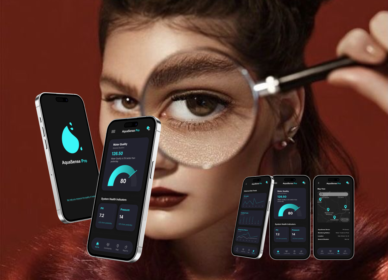
Aqua Sens Pro is a cloud-based platform designed to monitor water safety and pipe conditions for well owners, particularly in cold environments where freezing, leaks, and contamination are common risks. The system connects to sensors installed on water pipes and provides real-time insights into water quality and infrastructure status. The dashboard helps users quickly understand what is happening, respond to alerts, and decide when action is needed.
As the product designer, my focus was on translating complex, continuous sensor data into a clear and usable experience that supports fast and confident decision-making in critical situations.
AQUA.
Aqua Sens Pro is a cloud-based platform designed to monitor water safety and pipe conditions for well owners, particularly in cold environments where freezing, leaks, and contamination are common risks.
The system connects to sensors installed on water pipes and provides real-time insights into water quality and infrastructure status. The dashboard helps users quickly understand what is happening, respond to alerts, and decide when action is needed.
As the product designer, my focus was on translating complex, continuous sensor data into a clear and usable experience that supports fast and confident decision-making in critical situations.
Introduction
I worked as a product designer on a cloud-based app for real-time monitoring of water quality and infrastructure conditions.
The main challenge was not collecting data, but making large amounts of sensor data easy to understand and act on. The sensor returns tons of data each second, and the first question was, which of these data should be shown on the app and which are less important? In what situations do users use the app? What are they expected to get from the app?
We had lots of questions that needed to be answered! We started with RESEARCH!
Research
Access to real end users was limited at this stage, so research started with stakeholder discovery sessions and competitive analysis. These sessions helped clarify who the users are, when they use the app, and what decisions they are expected to make.
I then analyzed data-heavy platforms such as smart home and monitoring applications. I compared their features, strengths, and weaknesses, with a strong focus on how they prioritize data and present alerts.
A key part of my role was deciding how to group and prioritize sensor data so users could understand the overall system status without extra effort.
Ideation
With research insights in place, the focus of ideation was not on adding features, but on reducing complexity and improving clarity. The question shifted from “What can we show?” to “What does the user actually need in this moment?”
Through structured ideation sessions, we explored different ways to simplify data presentation and highlight risk without overwhelming users. Many early ideas involved removing information rather than adding it.
Key design principles that emerged during this phase included:
Prioritizing visual signals and trends over raw numbers
Showing only essential data by default, with details available on demand
Treating notifications as the core of the experience, not an afterthought
Providing a sense of support and reassurance, especially when users feel uncertain
These principles guided decisions across the dashboard, alerts, and navigation, and helped keep the experience focused on clarity, speed, and confidence.
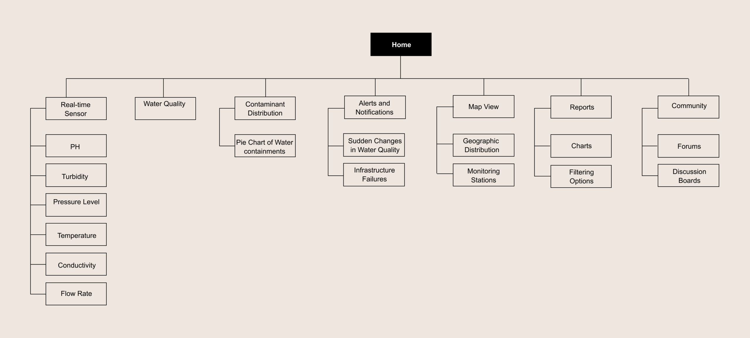
SiteMap
I created the sitemap to support fast decision-making and reduce unnecessary navigation. Since users typically open the app to check system status or respond to an alert, the structure was designed to surface critical information first and push secondary details deeper into the flow.
The dashboard acts as the main entry point, giving users an immediate sense of system health. From there, users can quickly access alerts, sensor locations on the map, and detailed data only when needed.
This structure helped keep the experience focused and predictable, especially in situations where users may be stressed or responding to a potential issue.
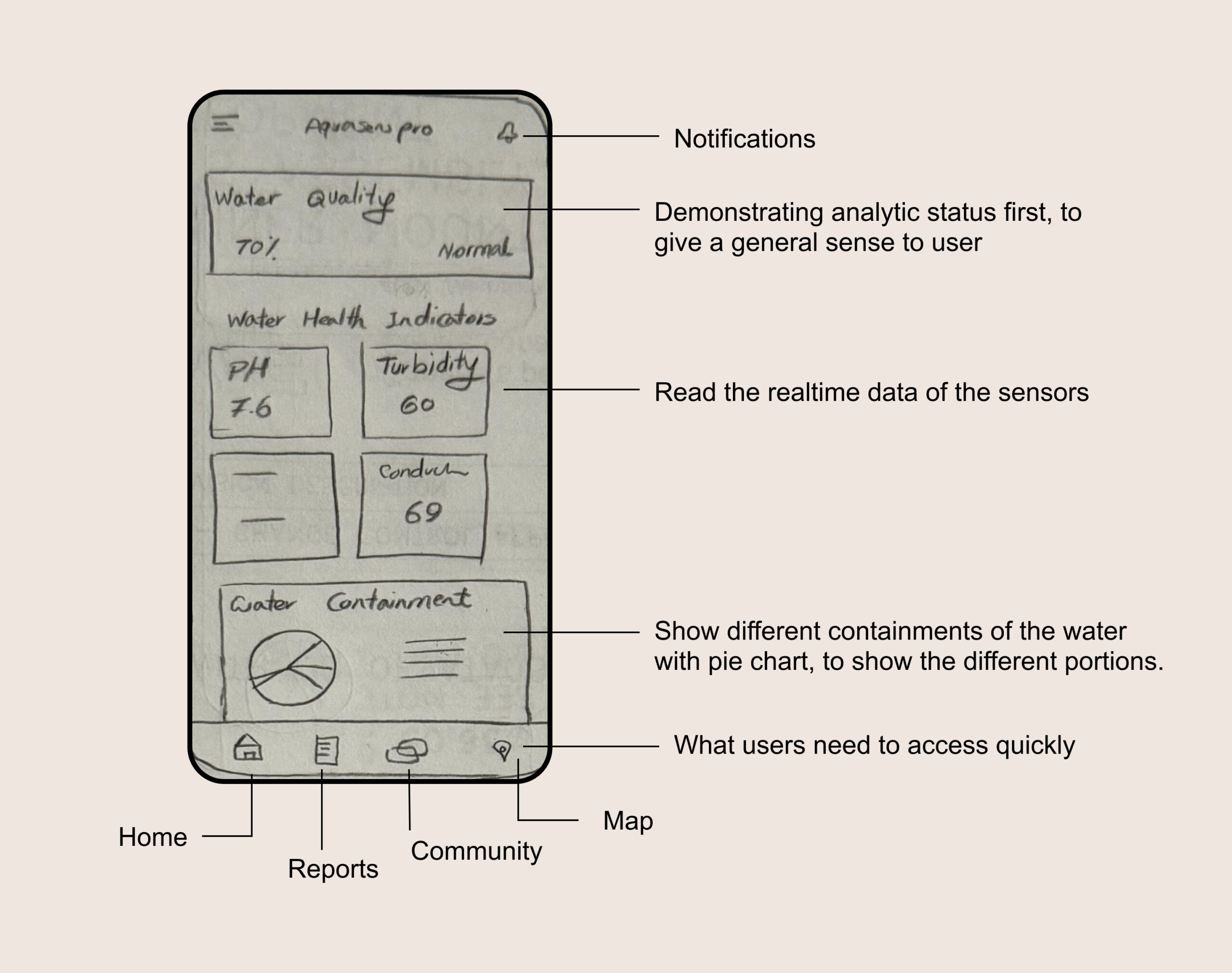
Visual Design
Visual design decisions were driven by clarity and speed, not decoration. The goal was to help users understand system status at a glance and recognize problems immediately.
I began with low-fidelity sketches to explore layout, hierarchy, and data grouping. Early exploration focused on how information could be scanned quickly, especially in alert-driven scenarios.
The dashboard was designed to answer three core questions within seconds:
Is everything working normally?
If not, where is the issue?
How serious is it?
To support this, I used clear visual hierarchy, strong spacing, and consistent color signals. Graphs were used to show trends rather than exact values, helping users recognize changes without reading numbers. Detailed data remained accessible but secondary.
Key dashboard areas included:
An overview section showing overall system status
A map view displaying sensor locations and current conditions
Supporting sections for alerts and community knowledge
Throughout the process, visual decisions were closely tied to usability, ensuring that the interface remained calm and readable even when communicating critical information.
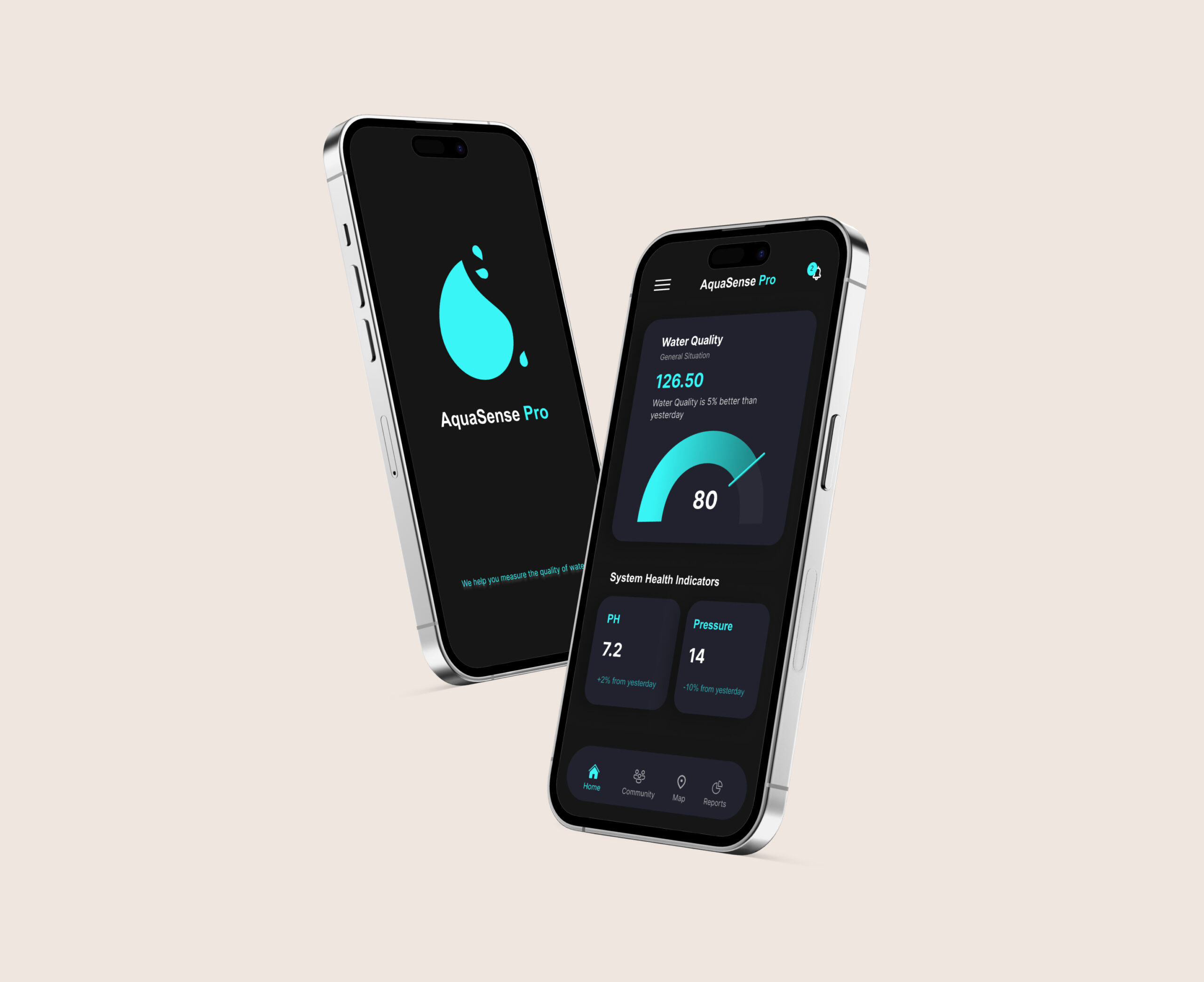
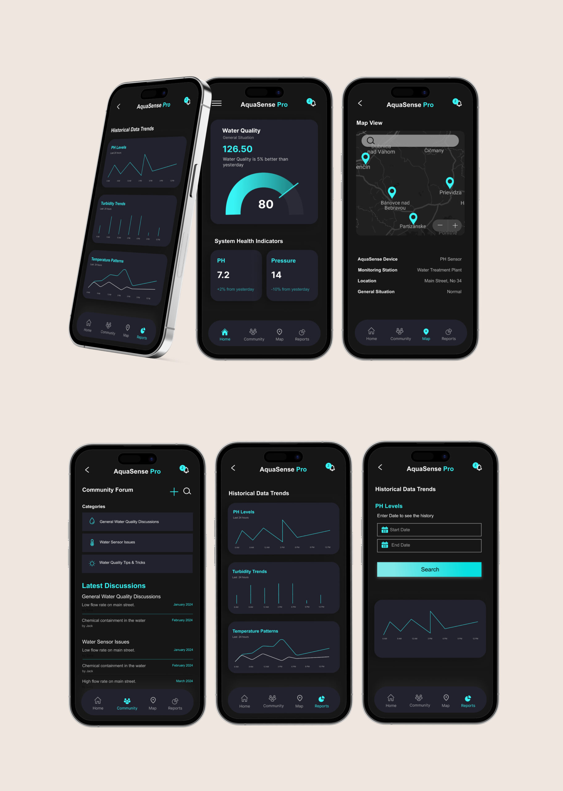
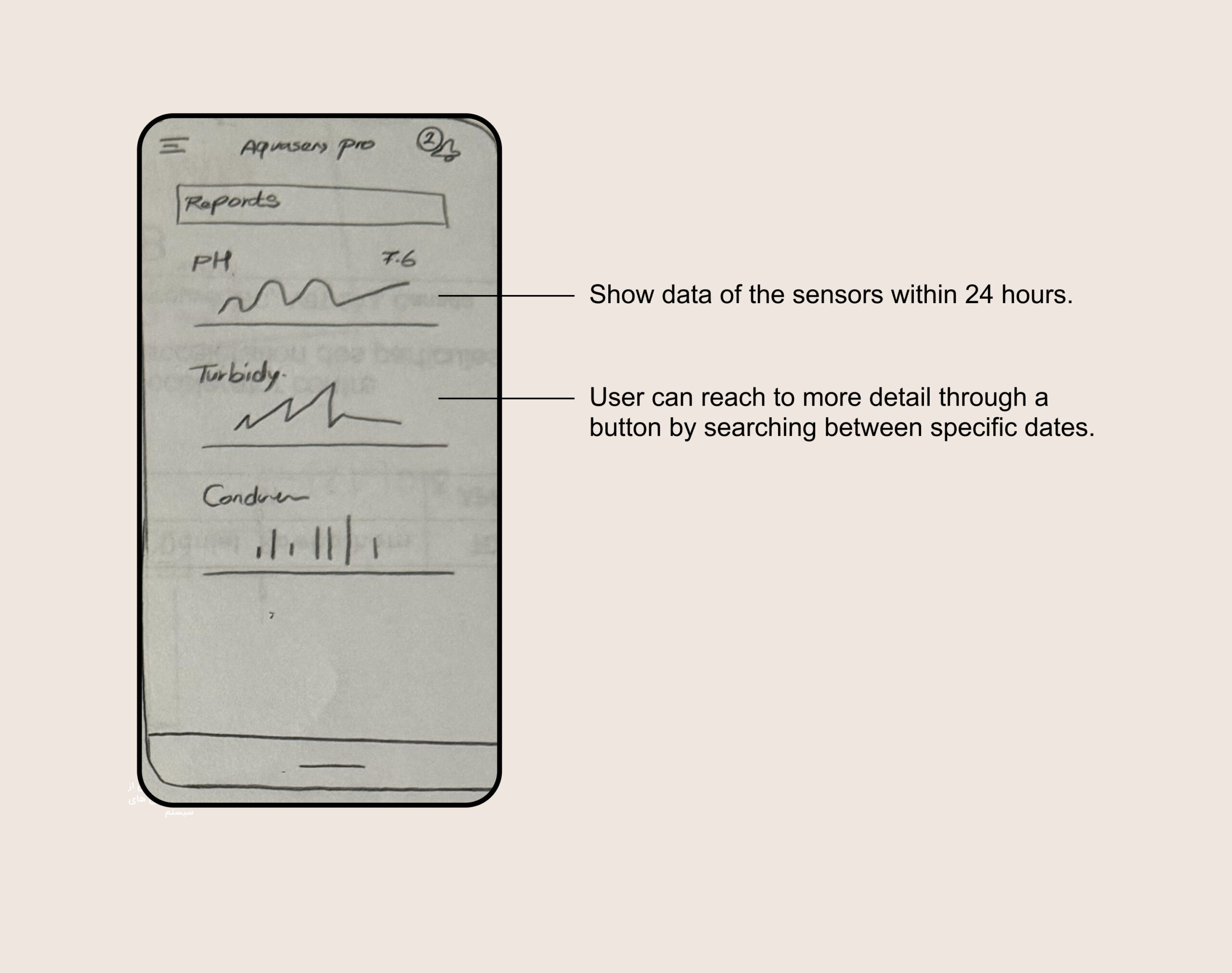
Dashboard
Dashboard
Show a graphical view of each factor’s data
Show a graphical view of each factor’s data
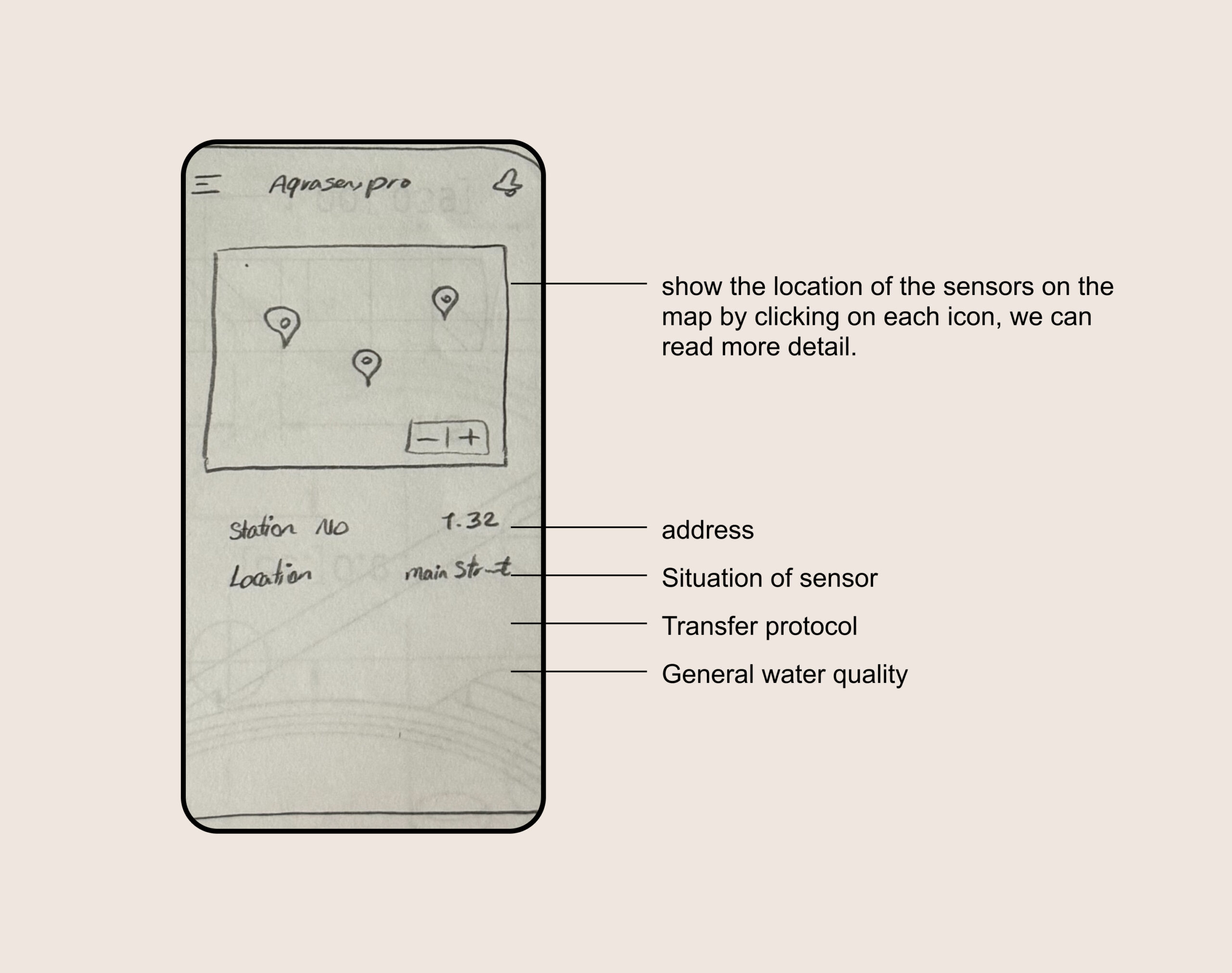
On a map show different sensor places and info
On a map show different sensor places and info
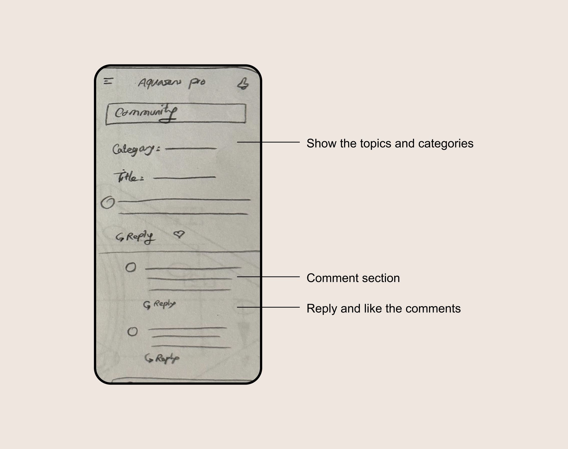
Community
Community
Wireframing
After sketching, the designs went through several iterations based on internal feedback and design reviews. I then created wireframes and interactive prototypes to test structure, navigation, and data hierarchy before moving into high-fidelity design.
Wireframing
After sketching, the designs went through several iterations based on internal feedback and design reviews. I then created wireframes and interactive prototypes to test structure, navigation, and data hierarchy before moving into high-fidelity design.
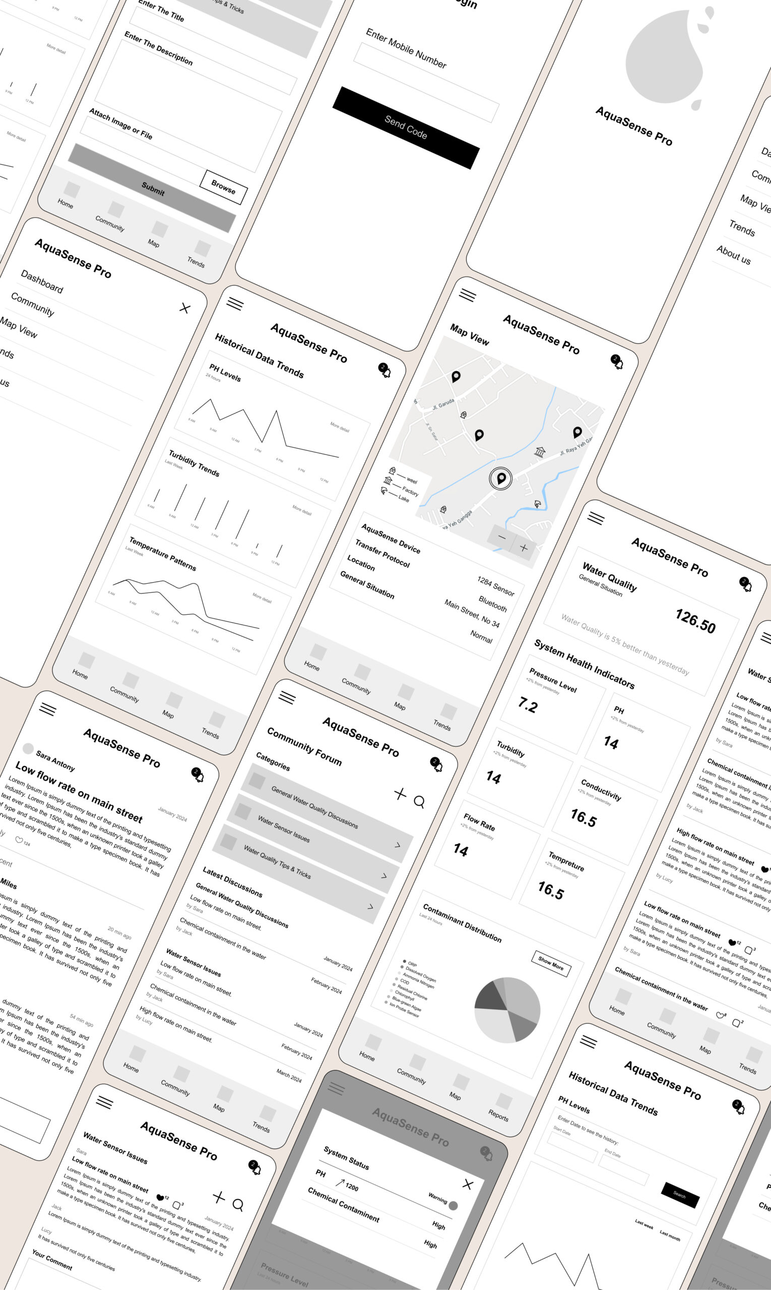
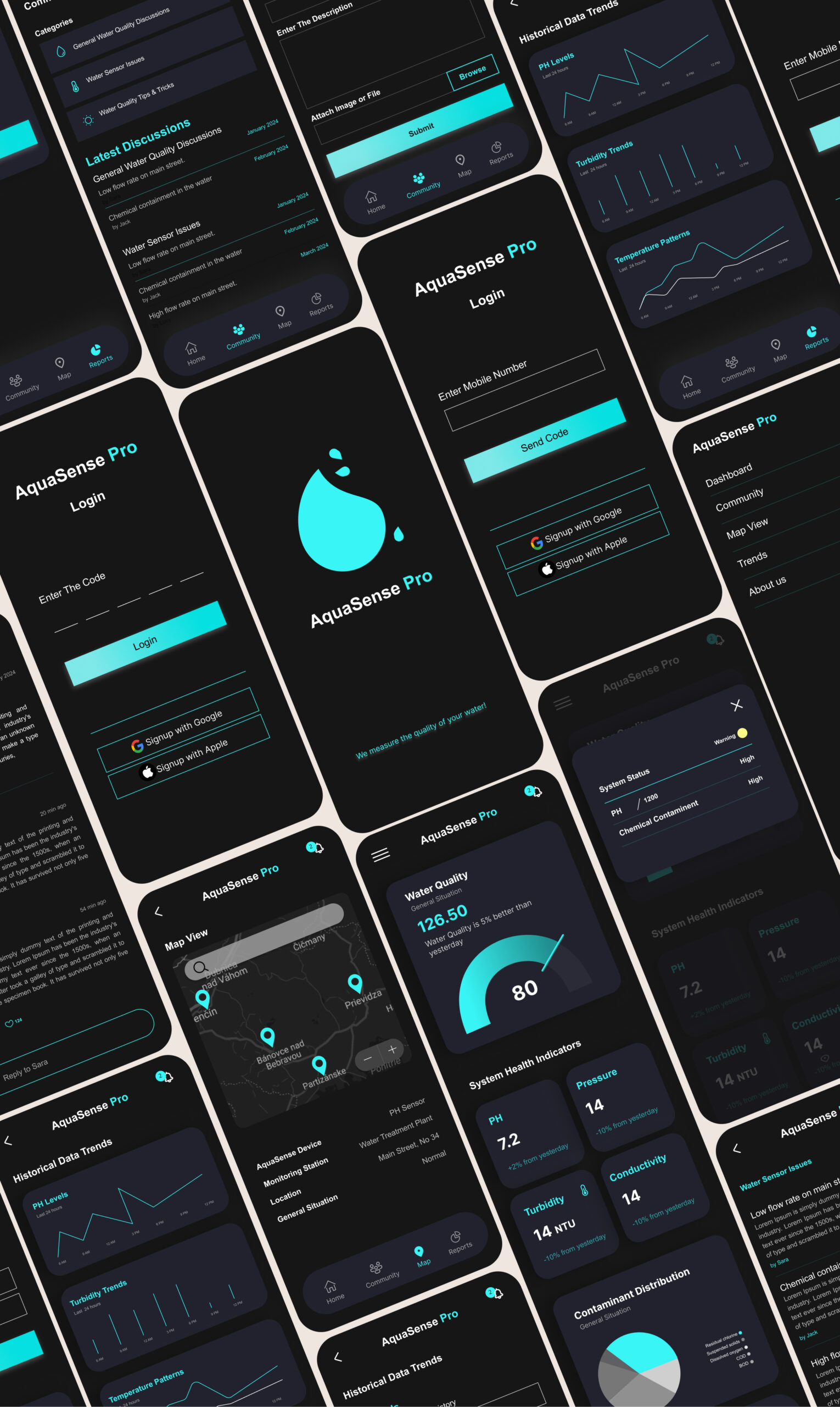
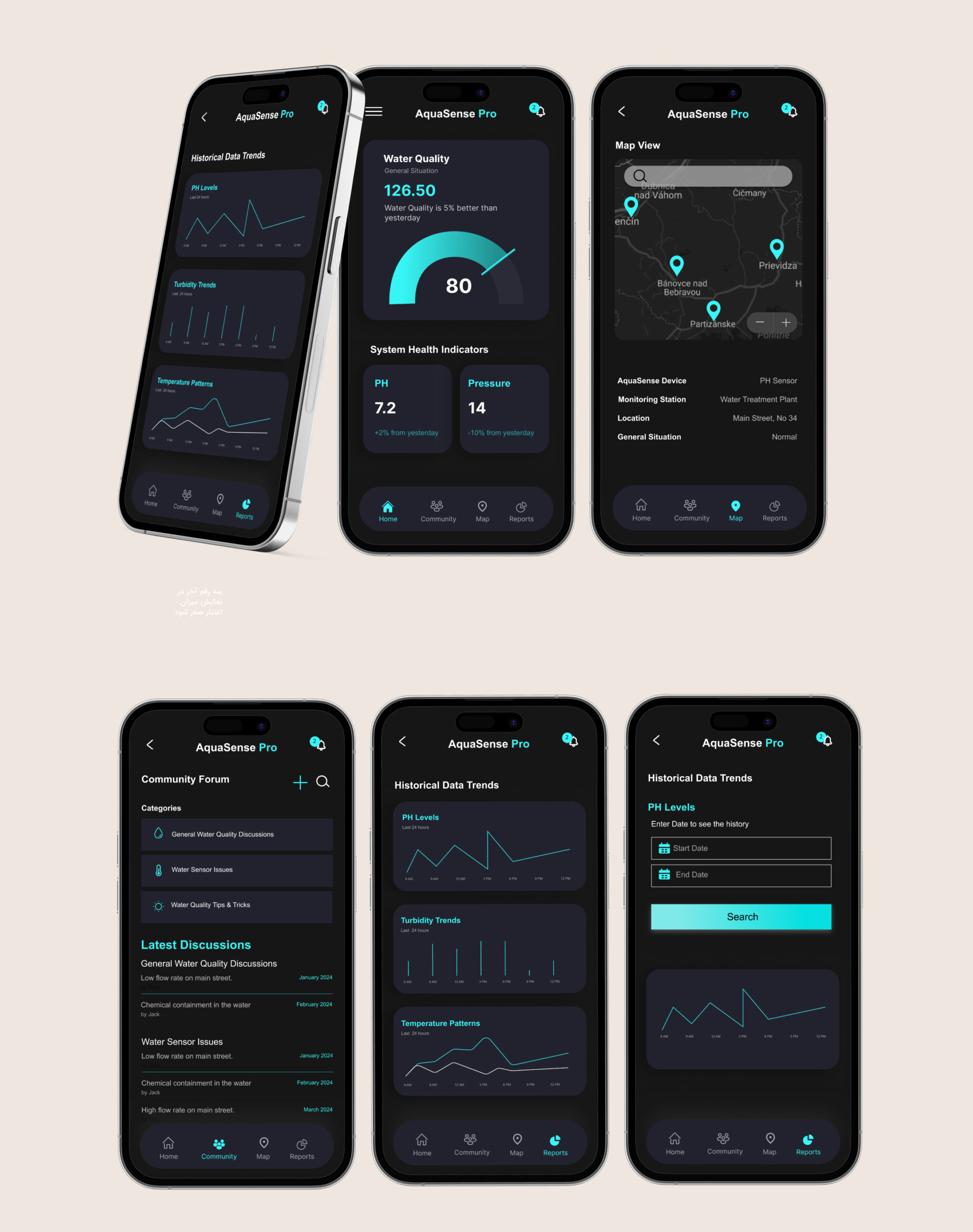
Mockups
Mockups
Usability Testing
Since the product was still in an early stage, usability testing focused on understanding clarity, navigation, and decision-making rather than measuring long-term usage. I used interactive prototypes to observe how users interpreted information, responded to alerts, and moved through the interface.
Testing sessions included guided walkthroughs, observation, and short interviews with representative users and stakeholders. The goal was to identify hesitation, confusion, and moments where users needed to stop and think, especially in alert-driven scenarios.
Rather than asking users what they liked, I focused on where they paused, asked questions, or missed important information. These moments directly informed design changes.
Key findings and iterations
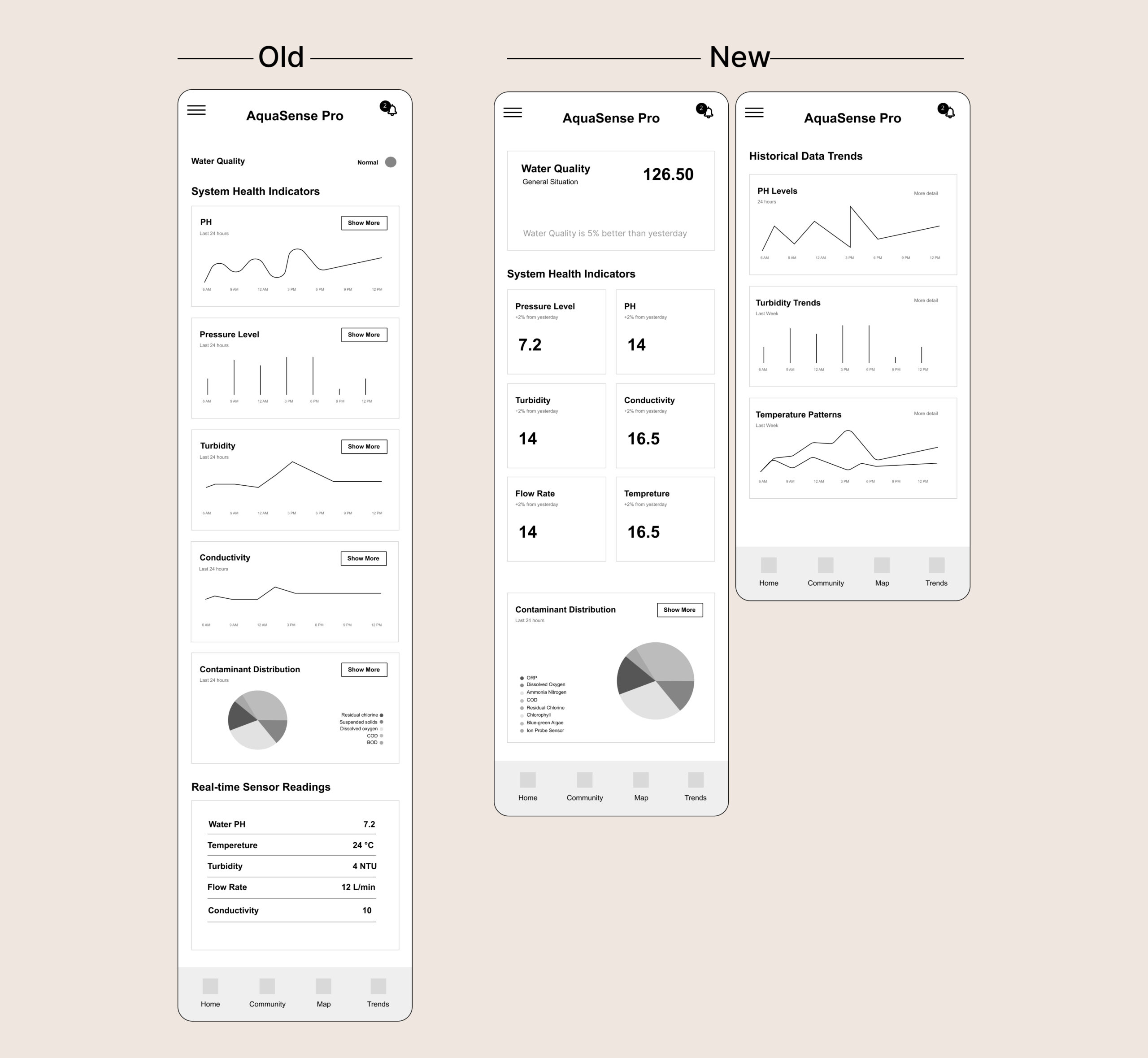
1. Dashboard focus
In early versions, historical data was shown on the main dashboard. During testing, users rarely engaged with this information when checking system status or responding to alerts. Most attention went to current conditions.
Based on this, I moved historical data to a separate screen and simplified the dashboard to prioritize real-time status and alerts. This reduced visual noise and helped users act faster.
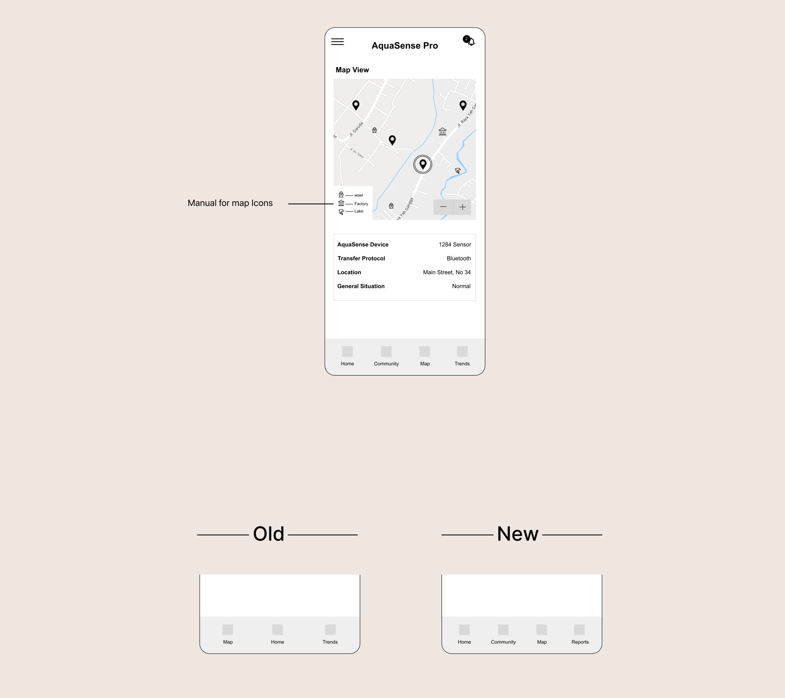
2. Map clarity
The map view was designed to give users spatial awareness of sensor locations. However, testing revealed that some icons caused hesitation. Users were unsure what certain symbols meant and needed extra explanation.
To address this, I refined iconography, improved visual consistency, and added a simple icon guide to support faster understanding without interrupting the flow.
3. Information confidence
Testing showed that users needed reassurance when everything was normal, not just warnings when something went wrong. This insight led to clearer “normal state” indicators, helping users trust the system and feel confident without over-checking details.
These iterations led to a clearer hierarchy and smoother decision flow. In later tests, users completed key tasks faster and with less hesitation compared to earlier versions.
Usability Testing
Usability Testing
Since the product was still in an early stage, usability testing focused on understanding clarity, navigation, and decision-making rather than measuring long-term usage. I used interactive prototypes to observe how users interpreted information, responded to alerts, and moved through the interface.
Testing sessions included guided walkthroughs, observation, and short interviews with representative users and stakeholders. The goal was to identify hesitation, confusion, and moments where users needed to stop and think, especially in alert-driven scenarios.
Rather than asking users what they liked, I focused on where they paused, asked questions, or missed important information. These moments directly informed design changes.
Key findings and iterations
1. Dashboard focus
In early versions, historical data was shown on the main dashboard. During testing, users rarely engaged with this information when checking system status or responding to alerts. Most attention went to current conditions.
Based on this, I moved historical data to a separate screen and simplified the dashboard to prioritize real-time status and alerts. This reduced visual noise and helped users act faster.
2. Map clarity
The map view was designed to give users spatial awareness of sensor locations. However, testing revealed that some icons caused hesitation. Users were unsure what certain symbols meant and needed extra explanation.
To address this, I refined iconography, improved visual consistency, and added a simple icon guide to support faster understanding without interrupting the flow.
3. Information confidence
Testing showed that users needed reassurance when everything was normal, not just warnings when something went wrong. This insight led to clearer “normal state” indicators, helping users trust the system and feel confident without over-checking details.
These iterations led to a clearer hierarchy and smoother decision flow. In later tests, users completed key tasks faster and with less hesitation compared to earlier versions.
On the map, users struggled to understand the meaning of our icons. We initially thought they were clear, but after testing, we added a manual for icons on the map.
By addressing user pain points, we aimed to provide a seamless experience that allowed users to monitor and manage their water health effectively. We achieved a 20% improvement in the number and duration of task completions, which shows our efforts had positive results for our users.
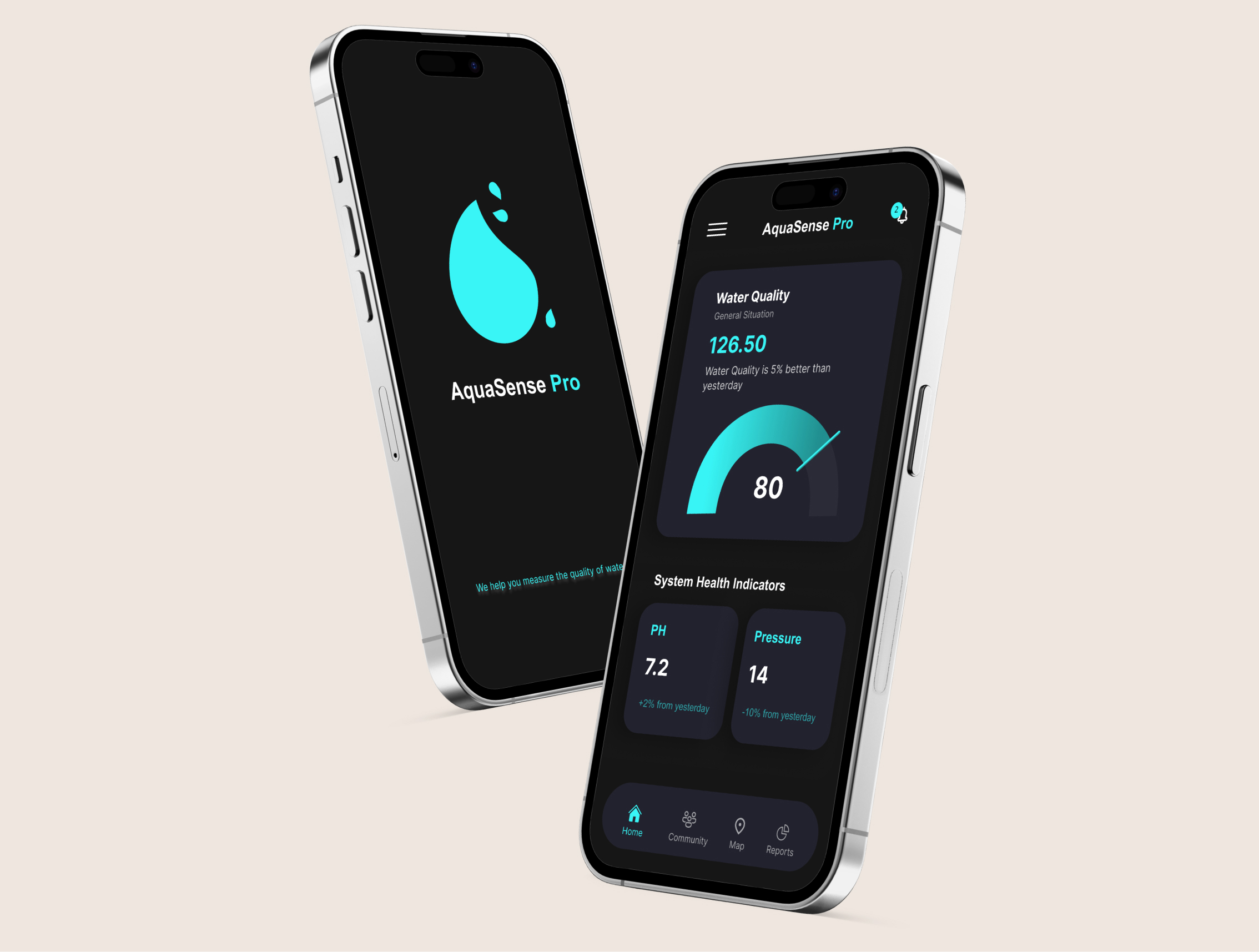
High-Fidelity Mockups
High-Fidelity Mockups
The Result
Although the product has not been released yet, usability testing across multiple iterations showed clear improvements in clarity and task flow. In later prototype tests, users were able to understand system status and respond to alerts with less hesitation compared to early versions.
By reducing visual noise, separating historical data from real-time information, and clarifying map interactions, the interface became easier to scan and quicker to act on. Internal feedback and testing outcomes confirmed that the final direction better supported fast, confident decision-making in critical situations.
What I Learned
This project reinforced how easily good intentions can lead to over-design, especially in data-heavy products. My initial instinct was to show all important information at once, assuming more data would create more confidence. Testing proved the opposite.
I learned that in safety-related and real-time systems, product design is mostly about prioritization. Deciding what not to show is just as important as deciding what to include. Small changes in hierarchy and placement had a big impact on how confident users felt.
This experience strengthened my ability to design under uncertainty, validate assumptions early, and use testing to guide decisions rather than relying on personal preference.
Next Step
If the project continues into production, the next focus would be on strengthening accessibility and alert handling.
On accessibility, I would review contrast, text scaling, and alert visibility to ensure the dashboard remains usable in stressful situations, low-light environments, and across different devices.
For notifications, I would refine alert severity levels and messaging, making sure users can immediately understand what is happening, how urgent it is, and what action to take. This includes improving alert wording, visual hierarchy, and confirmation states to reduce panic and prevent misinterpretation.
Both areas are critical for a safety-focused, real-time monitoring product and would be validated through additional testing once real-world data becomes available.
Other Projects