Brava Tactical is a Canada-based digital agency specializing in software development, SEO, PPC management, and digital strategy. Their philosophy, “Macro first, Micro second,” defines how they see the digital world — with a tactical overview before diving into technical execution.
The Challenge
Their old website was content-heavy, lacked structure, and didn’t communicate the company’s real strengths: strategic thinking and reliability.
Our challenge was to:
Clarify the brand’s message and value proposition
Modernize the visual identity while keeping it professional
Create a flexible system that supports multiple service categories
Design for trust, growth, and conversion
The Discovery
I began by researching Brava’s core values, audience, and communication style. The goal was to uncover what truly defined them beyond services and buzzwords.
Key Insights:
Brava is a growth partner, not just a service provider.
Their tone is professional yet empathetic.
They see marketing through a macro view first, micro view second.
The brand should feel straightforward, reliable, and next-level.
These insights became the foundation for the visual and verbal direction.
Brand Direction
From Structure to Flow
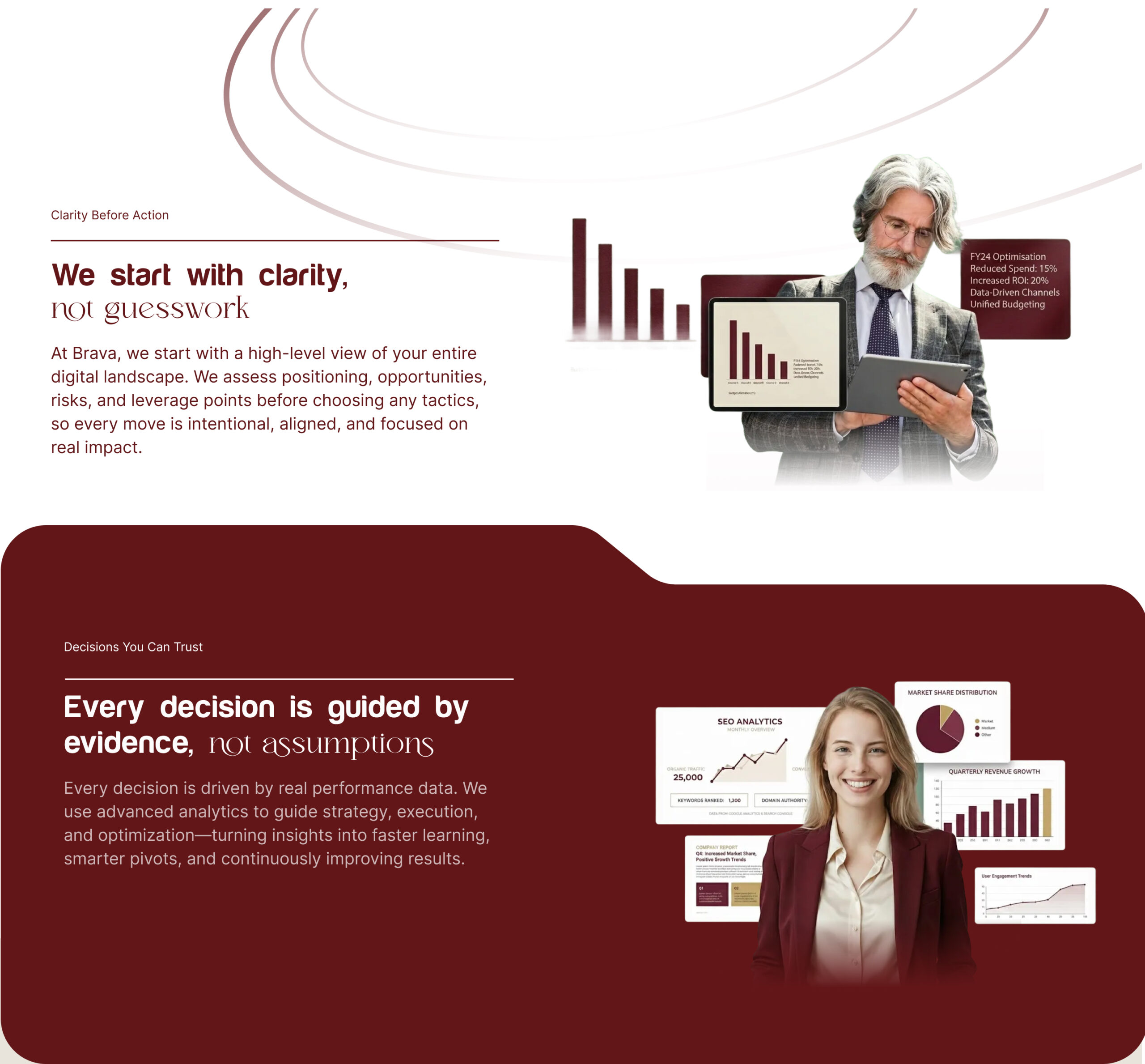
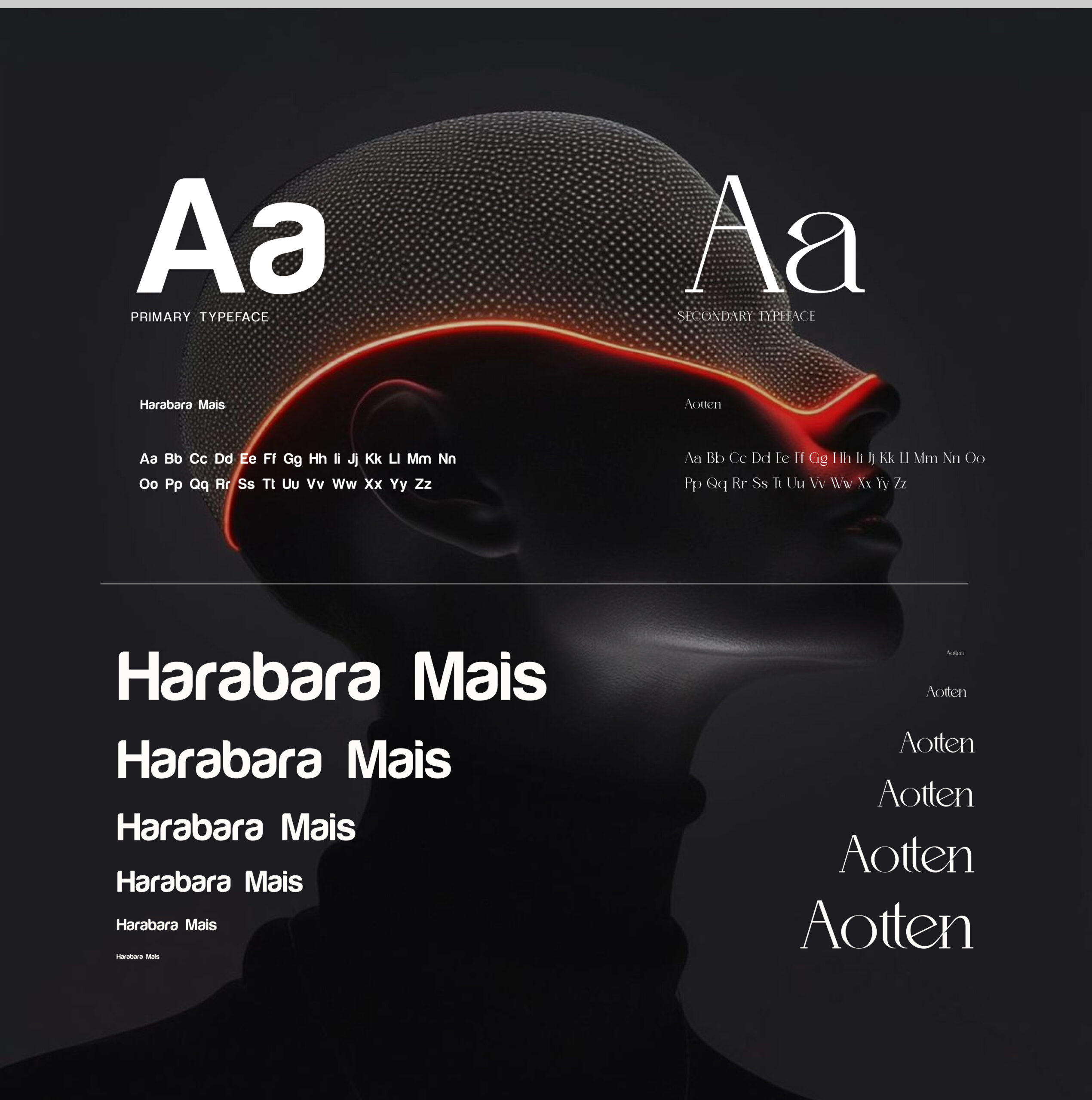
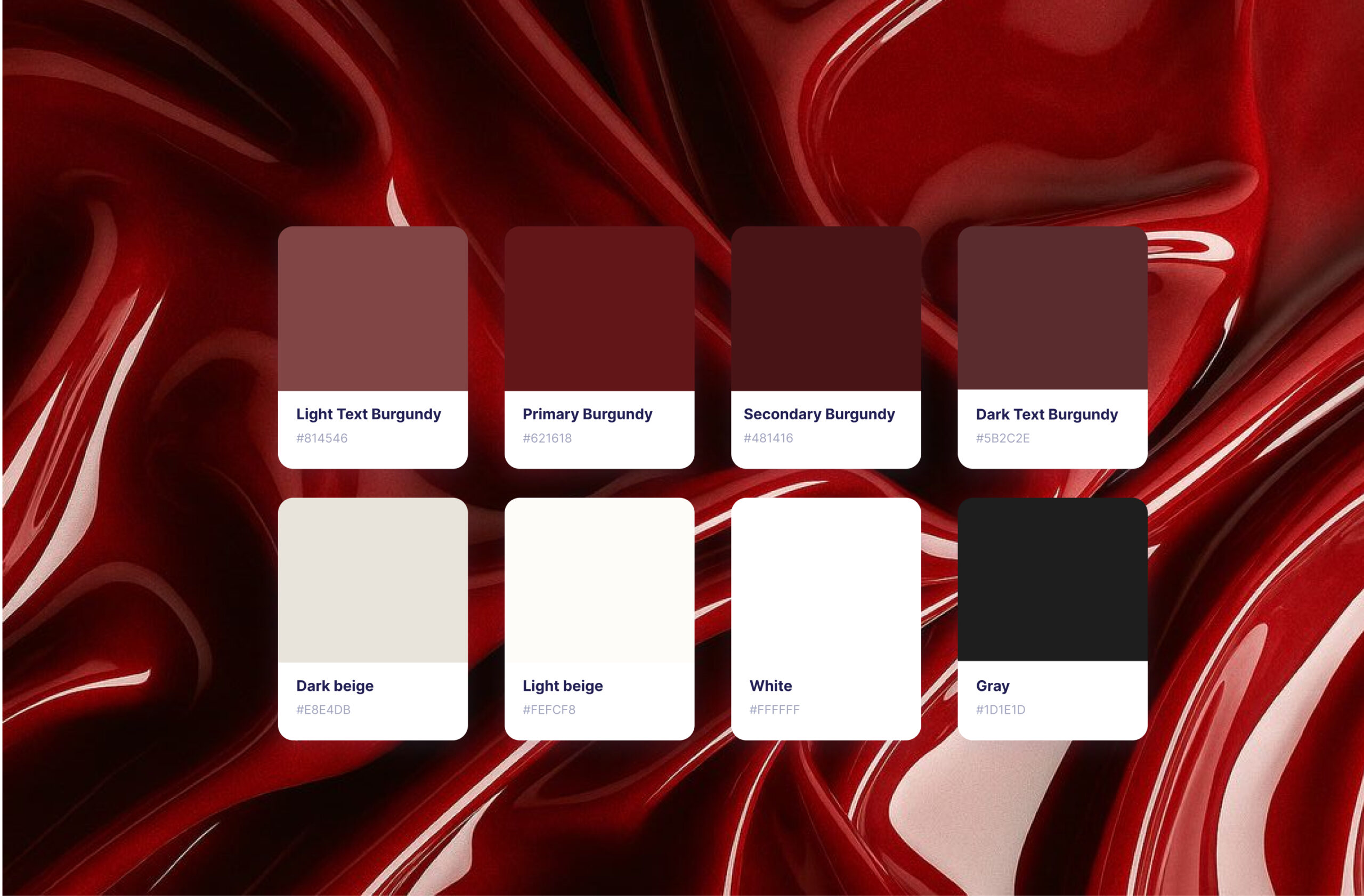
The brand personality was built around a balance of rectangular logic and circular empathy. The rectangular side represents precision, order, and structure. The circular side brings warmth, openness, and emotional connection. I translated this duality into every design choice — from typography pairings to icon shapes and imagery style. I created a scalable typographic system to bring visual consistency across all pages. The final mix of two complementary fonts expressed Brava’s dual nature: structured yet human. The color palette followed the same logic — a neutral tactical base with a warm accent tone to evoke trust and energy.
I created a scalable typographic system to bring visual consistency across all pages. The final mix of two complementary fonts expressed Brava’s dual nature: structured yet human. The color palette followed the same logic — a neutral tactical base with a warm accent tone to evoke trust and energy.
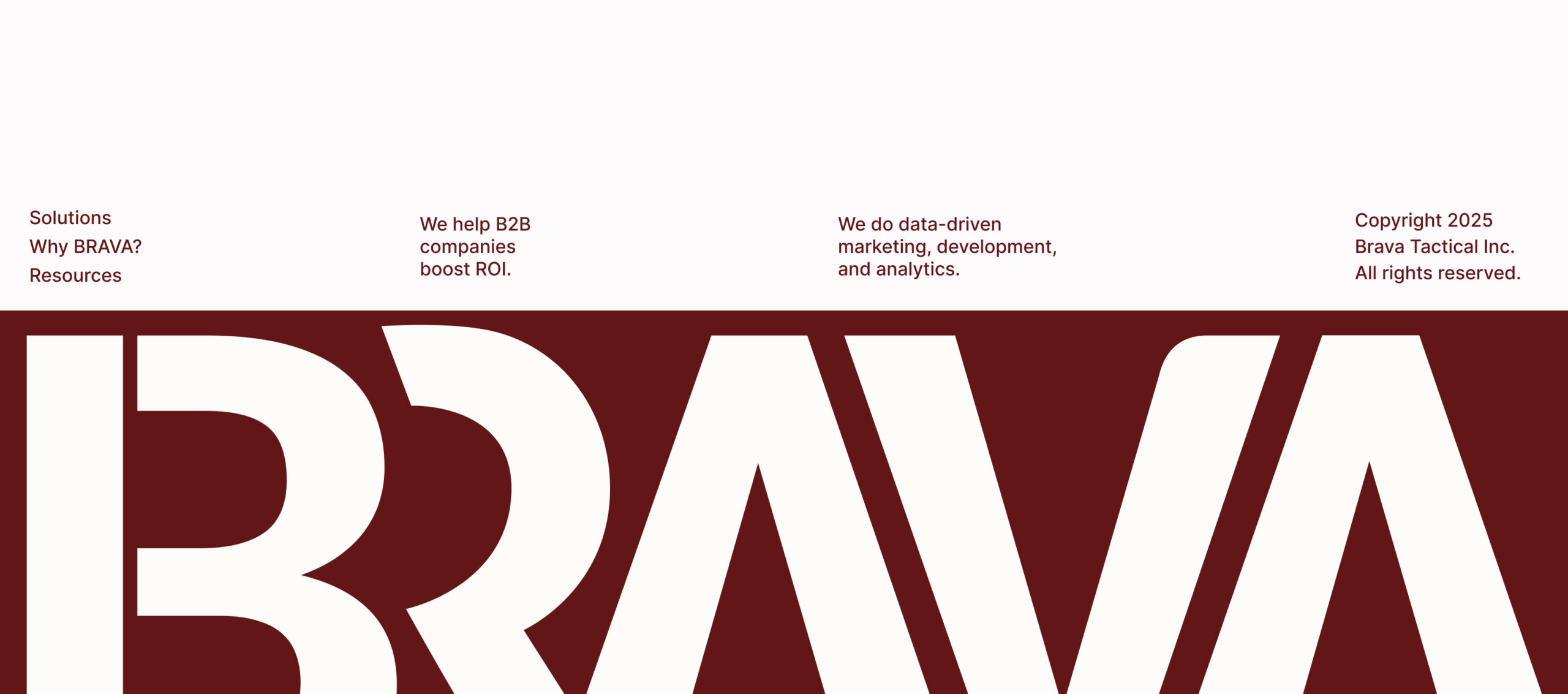
Typography & Colors
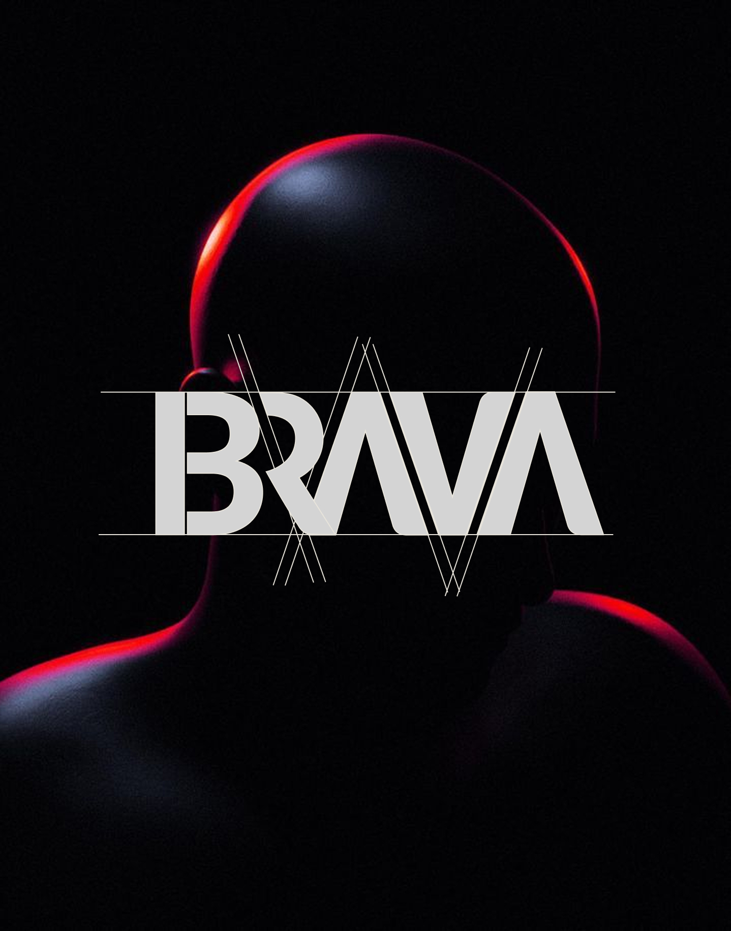
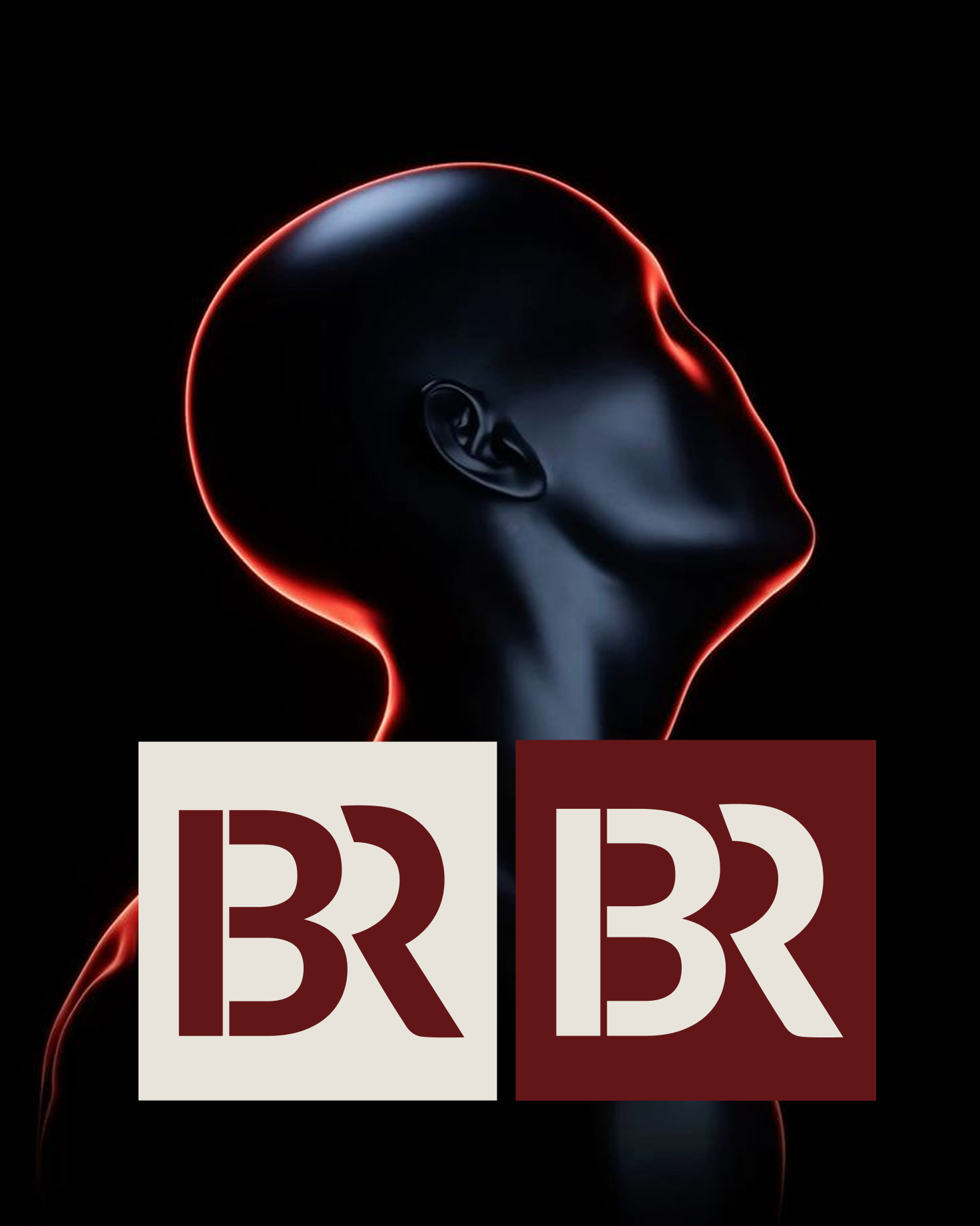
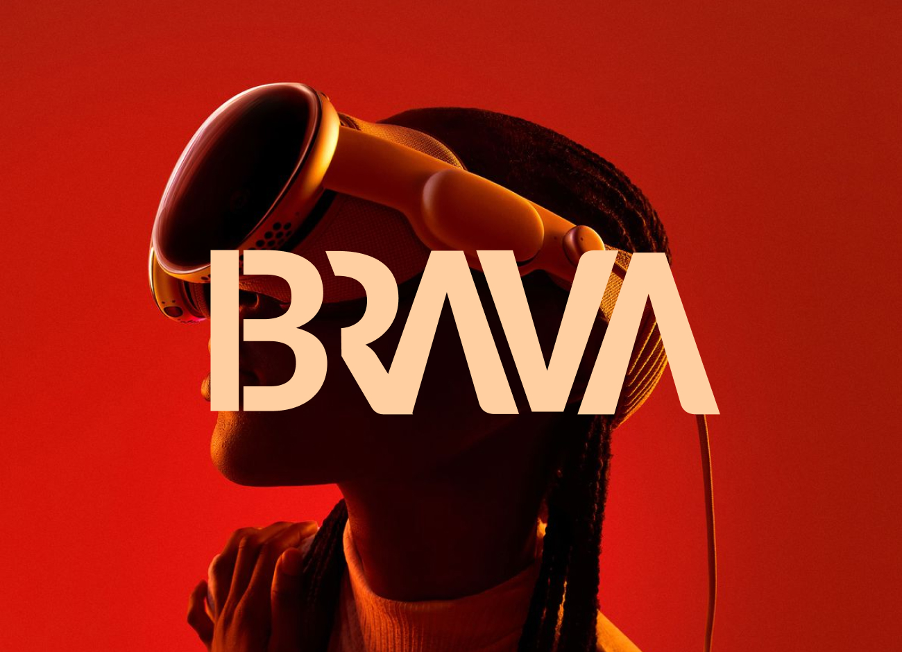
Logo Redesign
The Shape of Strategy
Brava’s logo was redesigned around its dual identity — tactical precision and human empathy. The final mark balances sharp rectangular edges with soft rounded forms, mirroring the brand’s visual system and tone of voice.
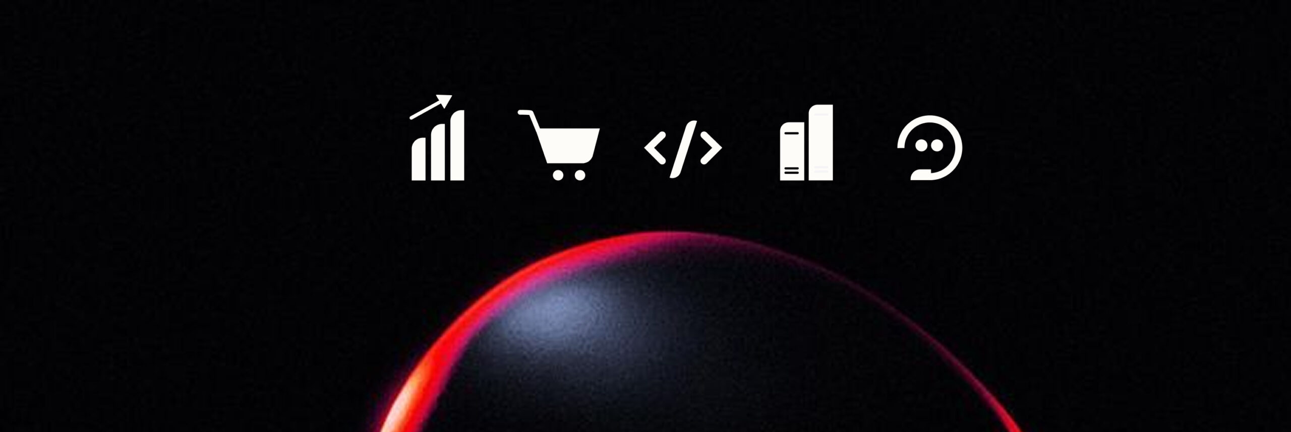
Iconography
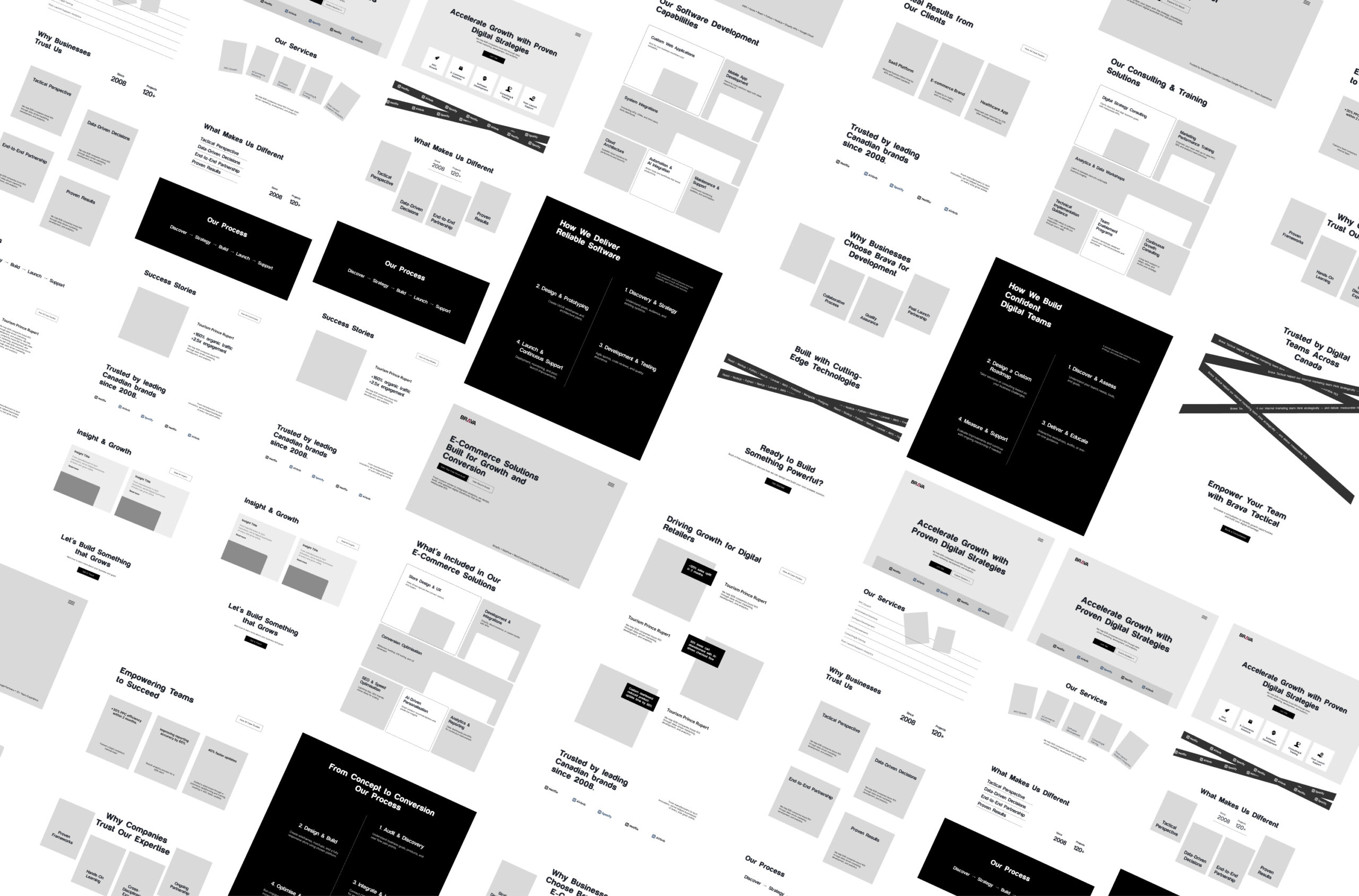
Wireframing
From Structure to Flow
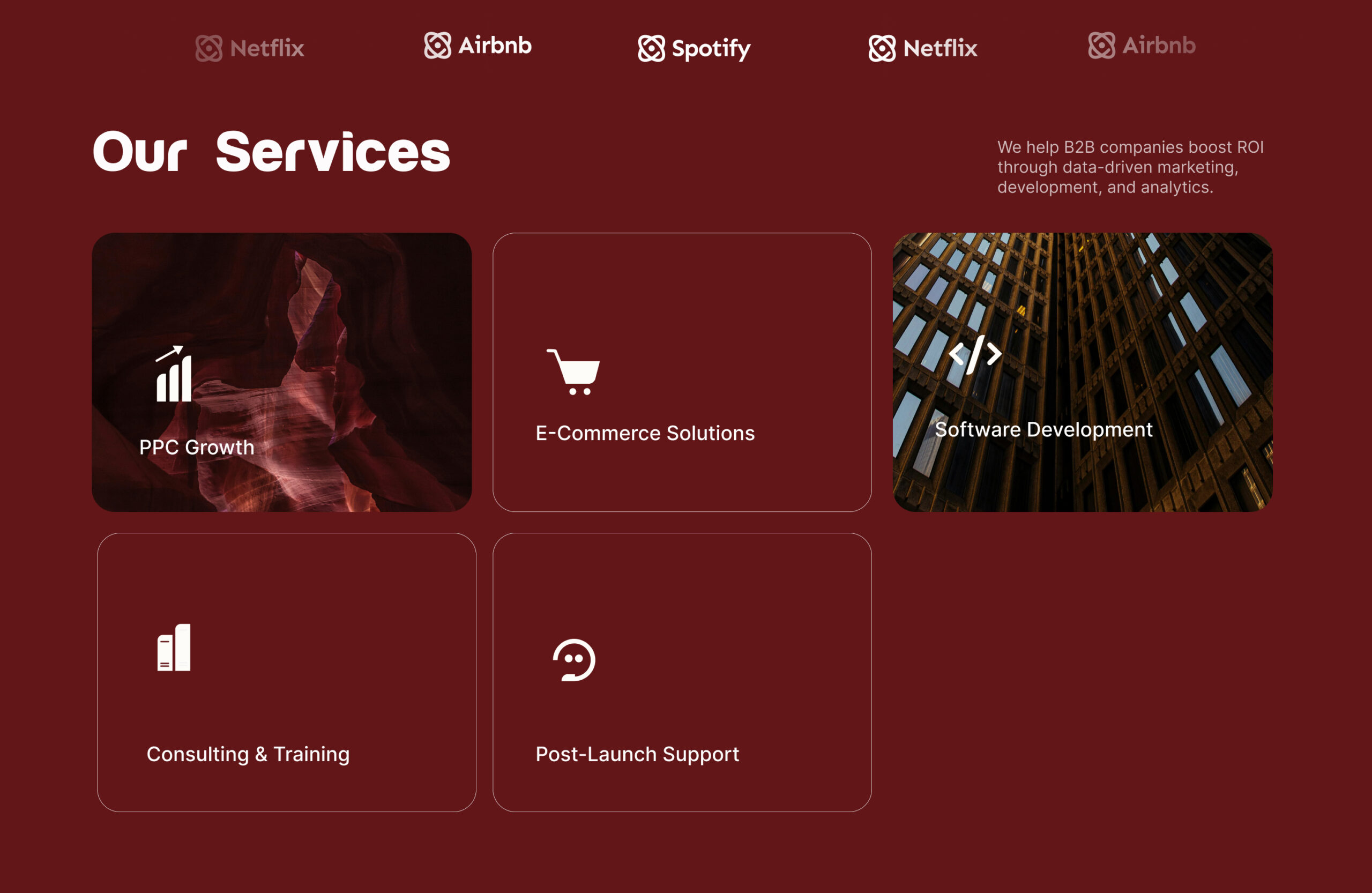
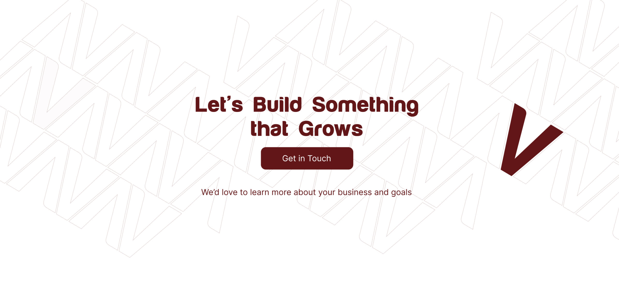
The wireframes focused on hierarchy and storytelling. Each page begins with clarity — what Brava does — then builds toward trust — why they’re different. By defining clear sections and CTAs, I turned a complex service offering into a structured, digestible experience.
UI DESIGN
Turning Strategy into Interface
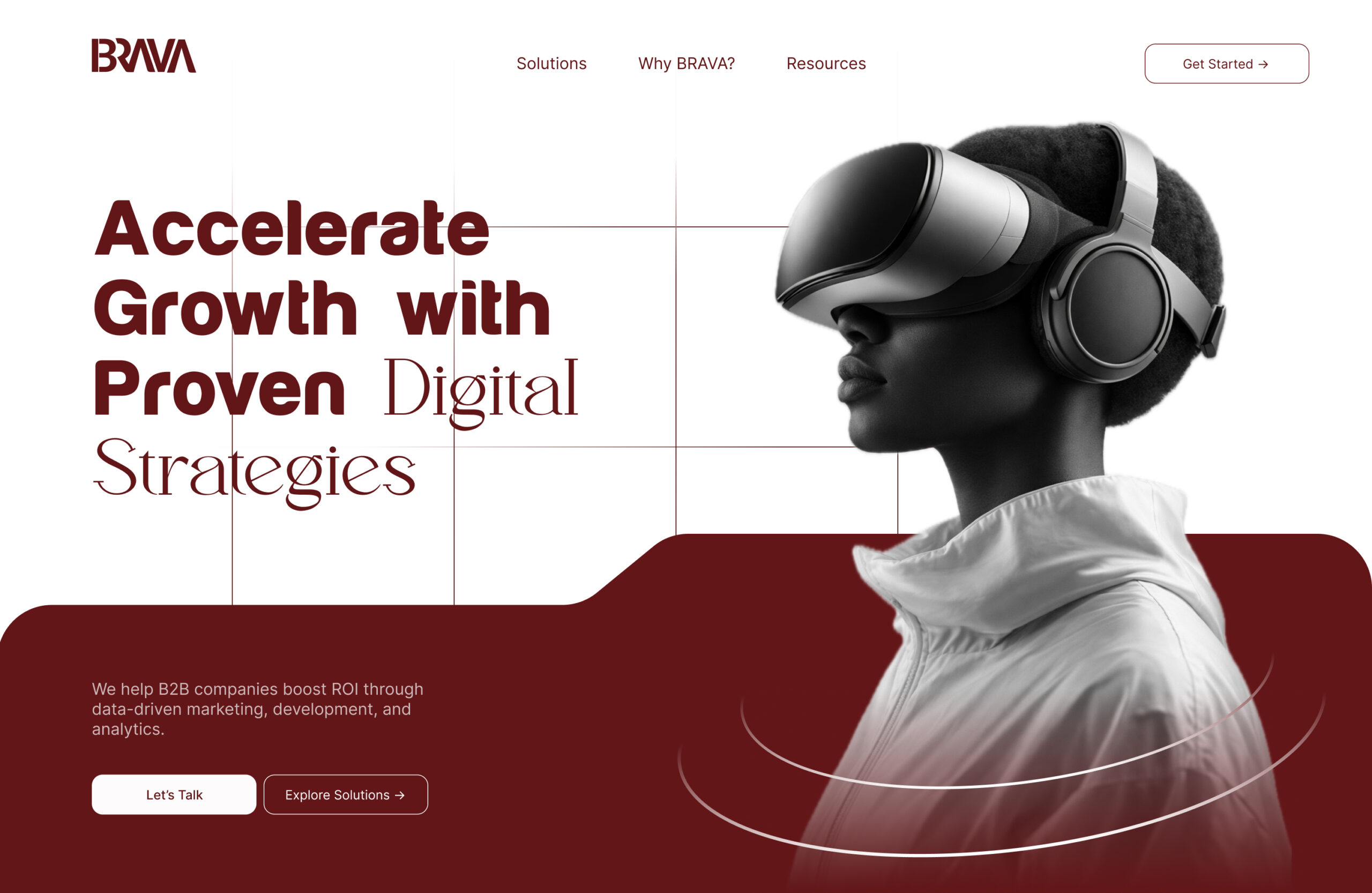
I used AI-generated imagery inspired by Brava’s tactical mindset — aerial views, connected networks, and macro perspectives. The final UI combined clarity, rhythm, and subtle motion to convey control and intelligence. Every component was designed to feel professional yet approachable. After design approval, I implemented the website using Elementor Pro, HTML, CSS, and GSAP.
The redesign gives Brava a refined digital presence that reflects who they truly are: A strategic partner that sees the bigger picture.