The original website felt overwhelming. There were repeated sections, inconsistent styles, and too many CTAs with equal weight. Navigation was unclear, visuals were cluttered, and important tools like the Room Visualizer were hidden within menus.
My goal was to redesign the website to be more modern, minimal, and intuitive. I wanted users to feel like they were exploring a high-end space—clean, easy to browse, and full of confidence-building moments.
The Challenge
First, based on UX best practices, I analyzed the current website and user flows to understand the user journey and identify pain points in navigation. I’ve highlighted the sections that need improvement directly on the screenshots.
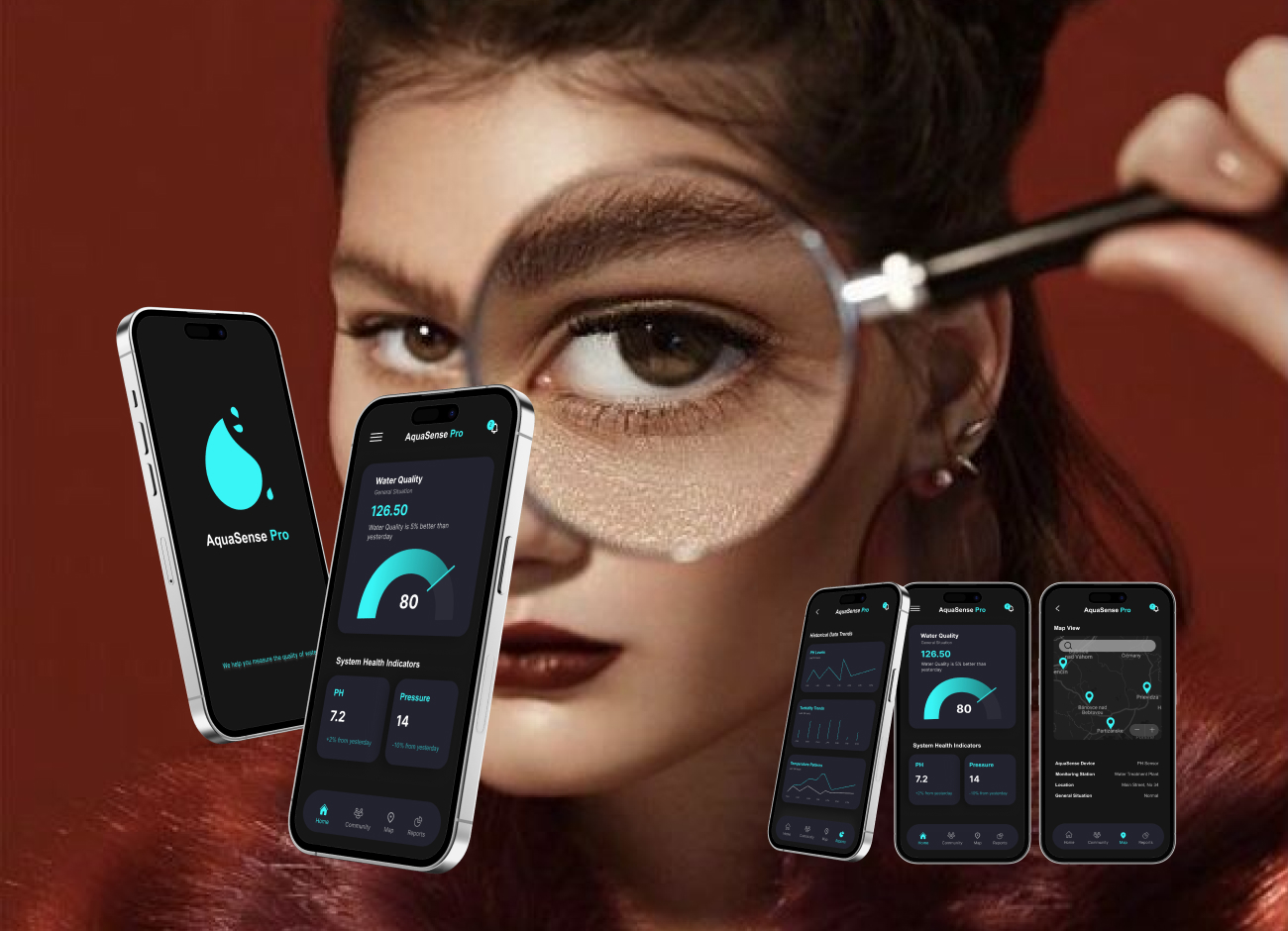
I reviewed competitors like Home Depot, King of Floors, and Canada Floors Depot to better understand user expectations and identify opportunities. After gathering general information about the target users, I began the competitive analysis, searching for different applications that display various sensor data to users, such as smart homes. I benchmarked them and created a table showing their features, advantages, disadvantages, and most importantly, the gaps they have. My task was to categorize the data on the dashboard for easy user access, ensuring immediate understanding of the sensors’ overall situation without extra effort. Additionally, I aimed to construct an interface reflecting the company’s dedication to innovation and technology. By using my expertise as a Product designer, I applied user-centric design principles to craft an intuitive and visually engaging platform for real-time sensor monitoring.
DESIGN DECISIONS
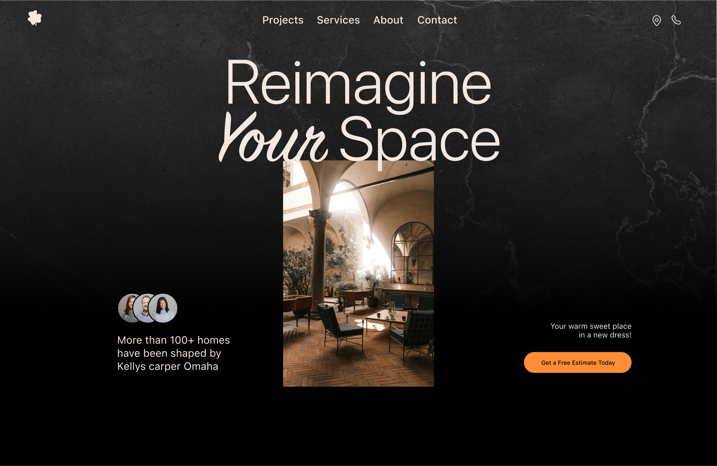
I designed this version to match the brand’s industry while giving it a modern, minimal look. The goal was to make the experience more enjoyable for users—so they feel like they’re exploring a high-quality, stylish space, and that feeling transfers to the product itself.
Here’s what I changed:
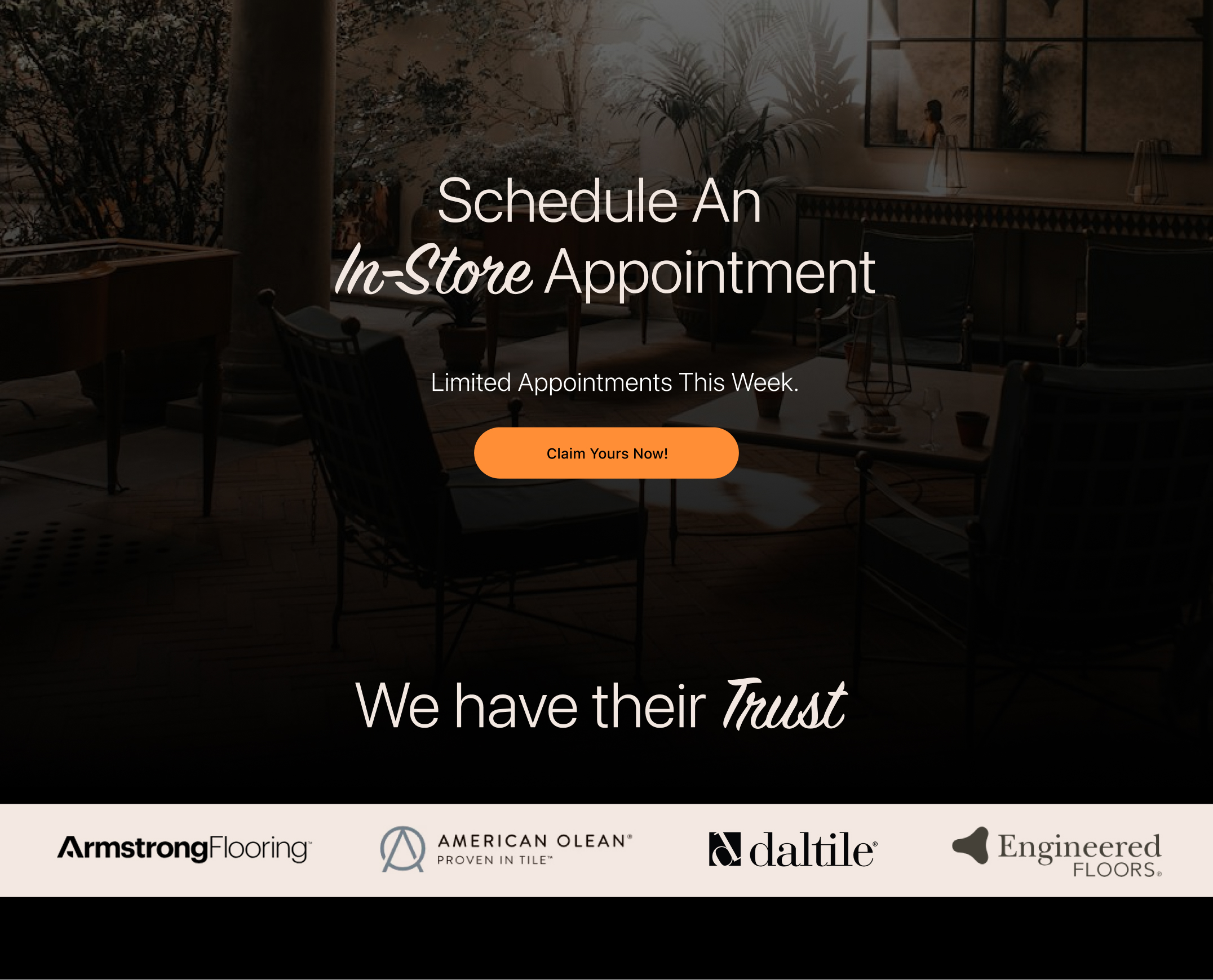
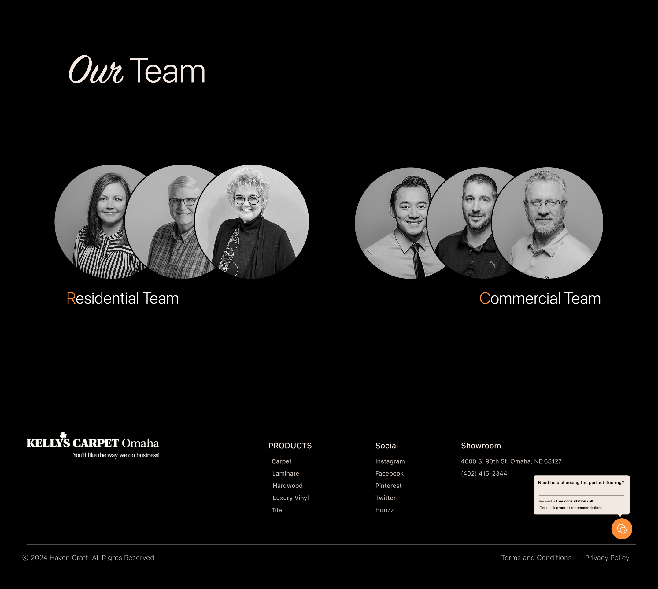
I used the logo icon instead of the full logo (pending stakeholder approval). Added more white space to make the design breathe and highlight the most important elements. Cut out unnecessary text and images to keep things clean and easy to scan. Improved text hierarchy so users can follow the content effortlessly. Moved the room visualizer to the landing page, so users can see how products look in real spaces and feel more confident in their choices. Added a FOMO-driven section with a bold CTA to encourage users to schedule an appointment. For consistency: I used black-and-white logos for the “Brands We’ve Worked With” section to keep the page visually clean and avoid clashing colors. In the Team section: I featured both Commercial and Residential teams, with link buttons to their respective pages.
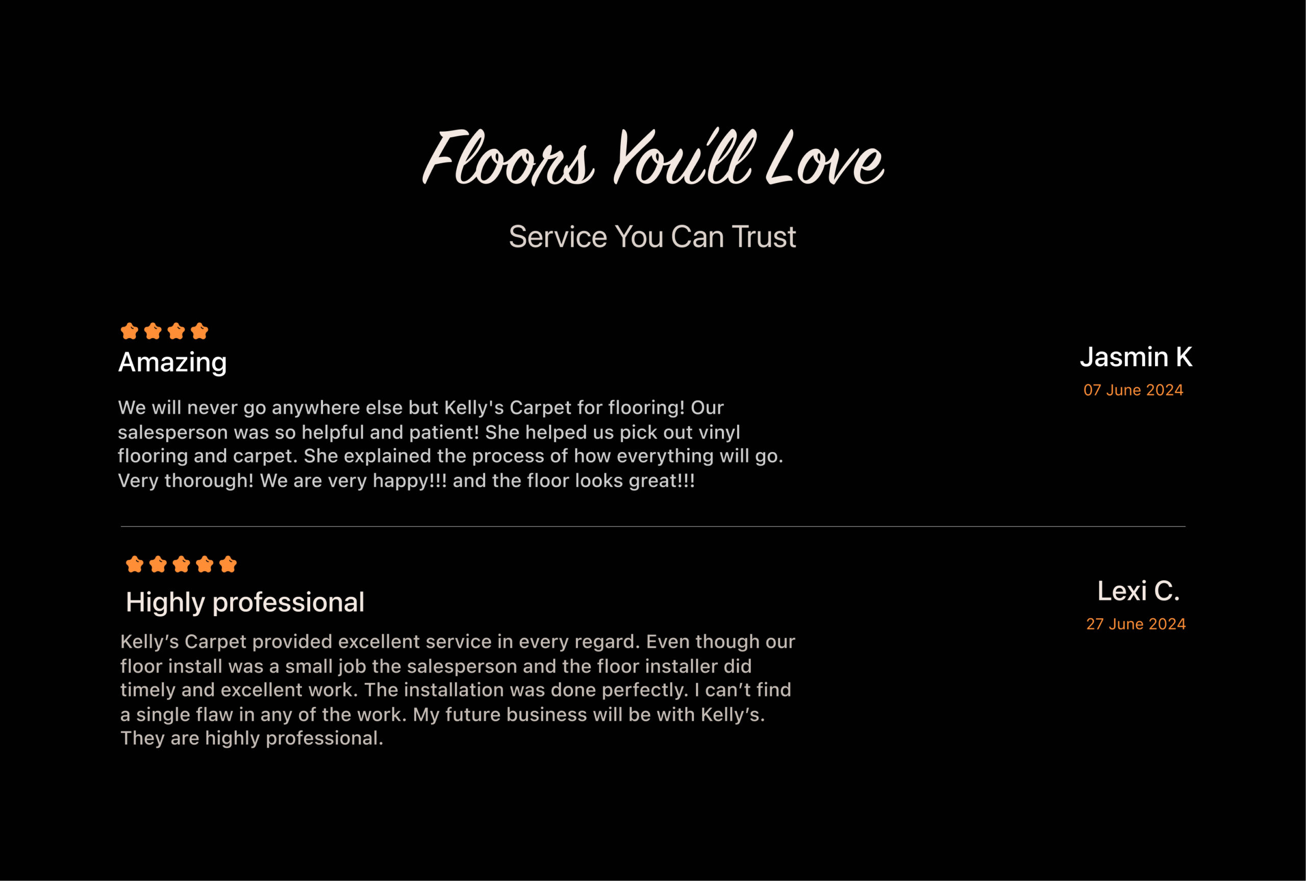
And finally, in the chatbox, I added pre-set buttons for a free consultation call and product recommendations, making it easier to turn visitors into customers. With a modern layout, balanced white space, and clear content hierarchy, this version helps users and the business connect smoothly. It makes key products and features easy to find without overwhelming users with too much information.
LEAD GENERATION
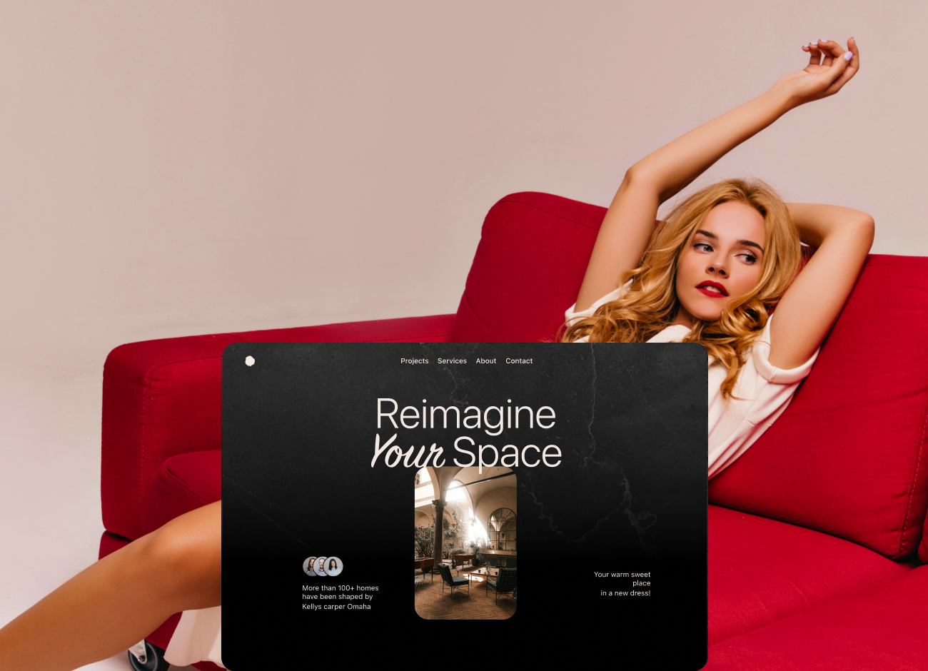
LANDING PAGE
In three key sections of the landing page, we’ll have a bold CTA placed within ample white space, a clean background, and the primary brand color to grab users’ attention.
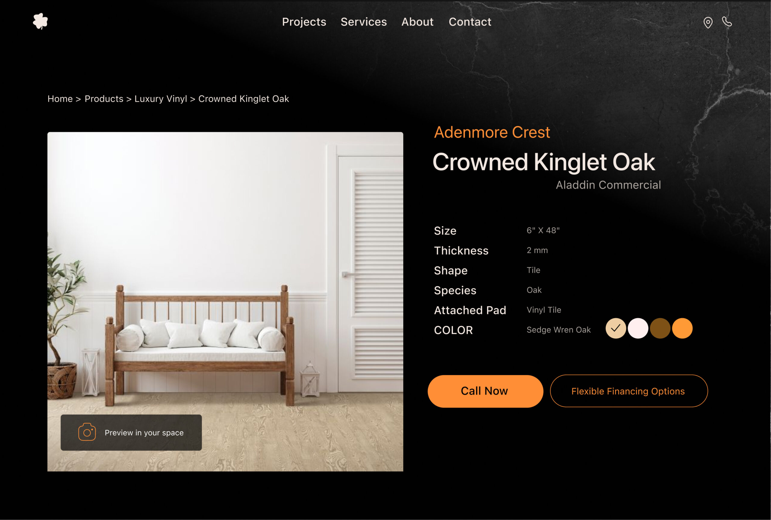
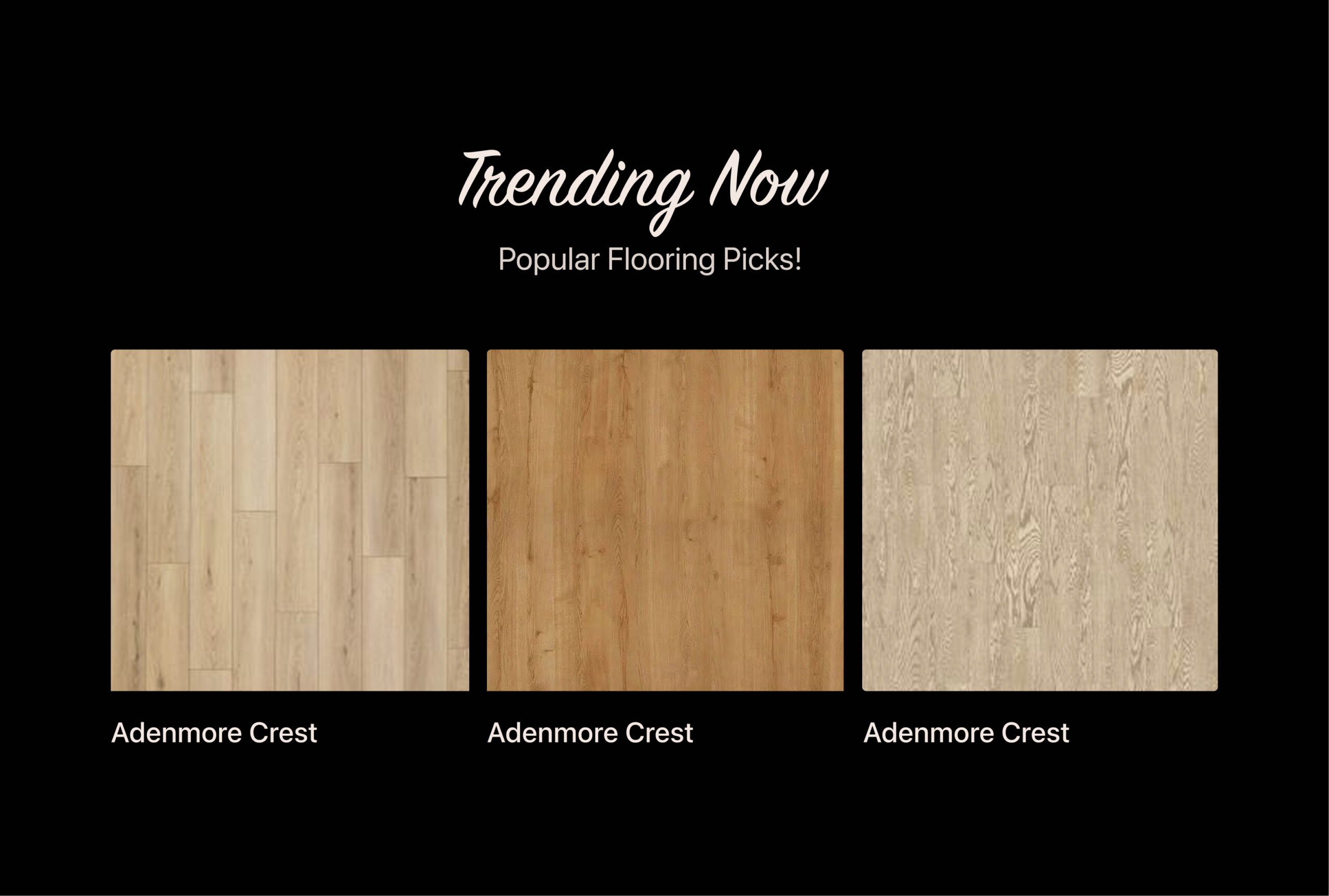
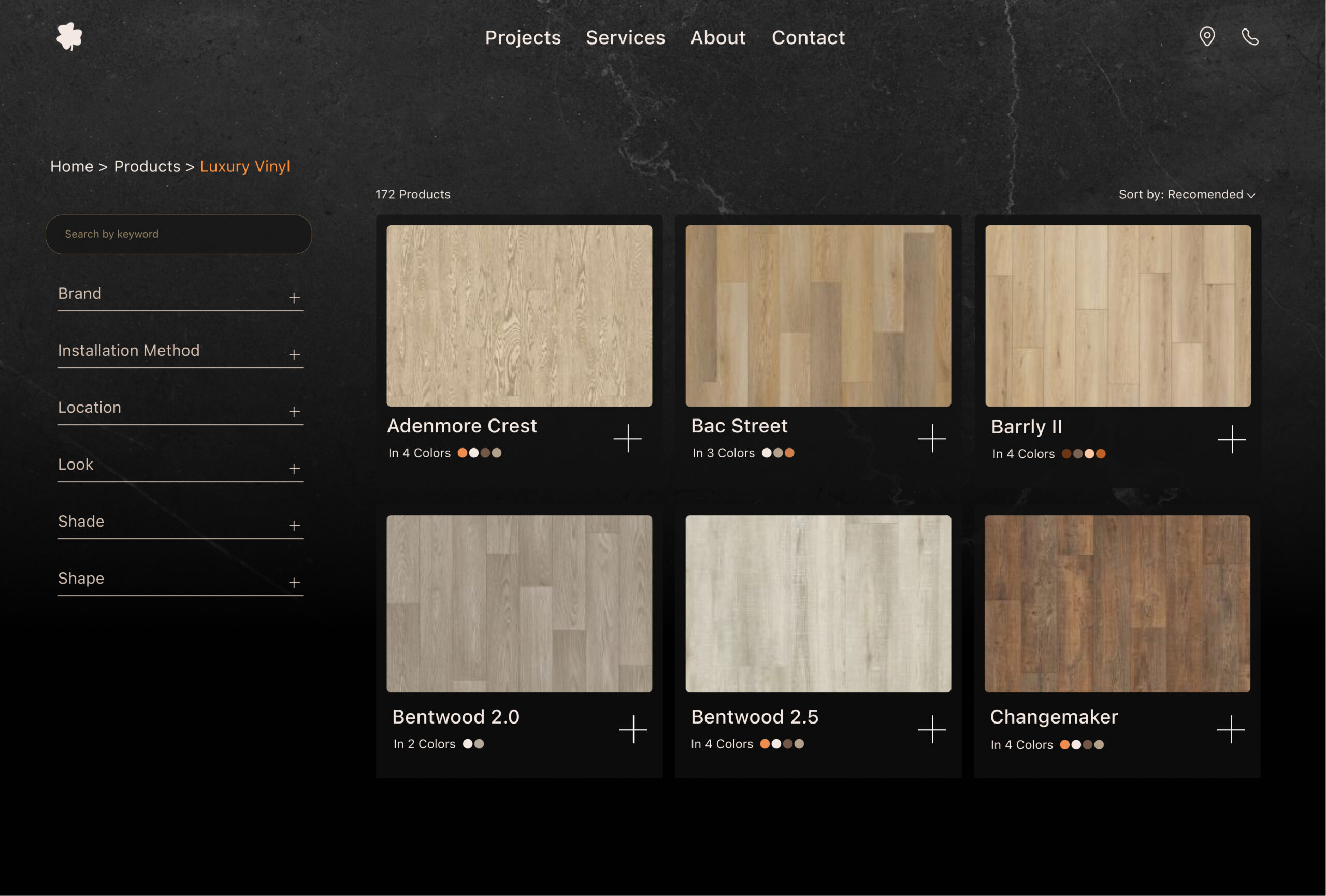
Product Page
I changed the shape of the primary button to a “+” to reduce visual clutter since there are already many buttons on this page. Instead, I’m using similar card designs to support the user’s learning process—each card represents a product to buy!
Product DETAIL Page
On this page, there were two buttons with the same style. I changed them to two distinct styles to help users focus on the main task. Now, we have a primary and a secondary button for better guidance.
ANIMATIONS &
MICROINTERACTIONS
Hero
Section
Scroll Animation
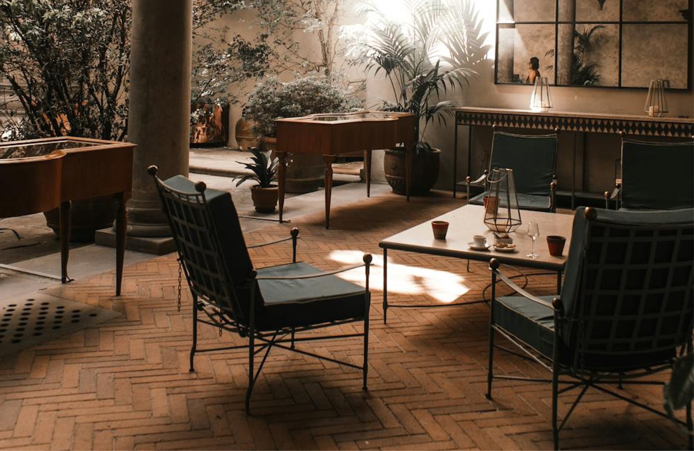
As you scroll, the center photo gets larger and fills the screen, helping users feel the space better.
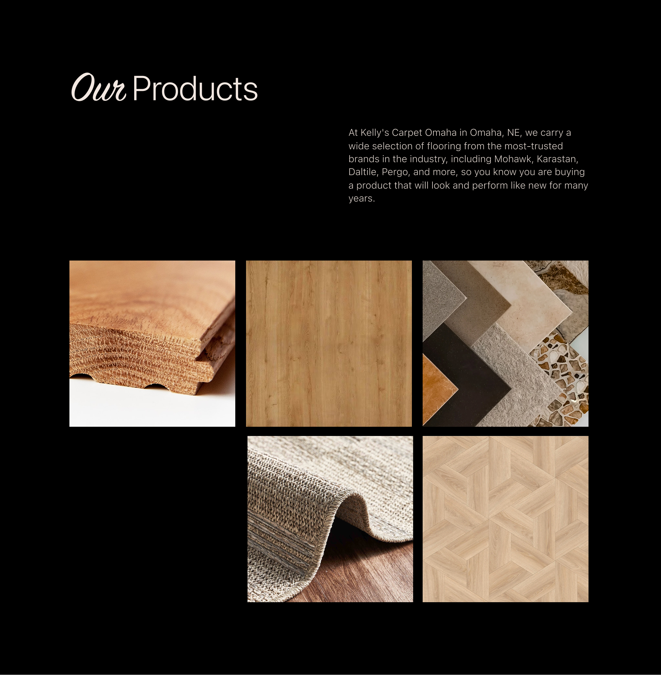
Our Product
Hover
Hovering over a photo adds a dark layer with the category name (Carpet, Laminate, Tile…).
Buttons &
Links
Hover
Hovering over a button changes its color to show something is changed.
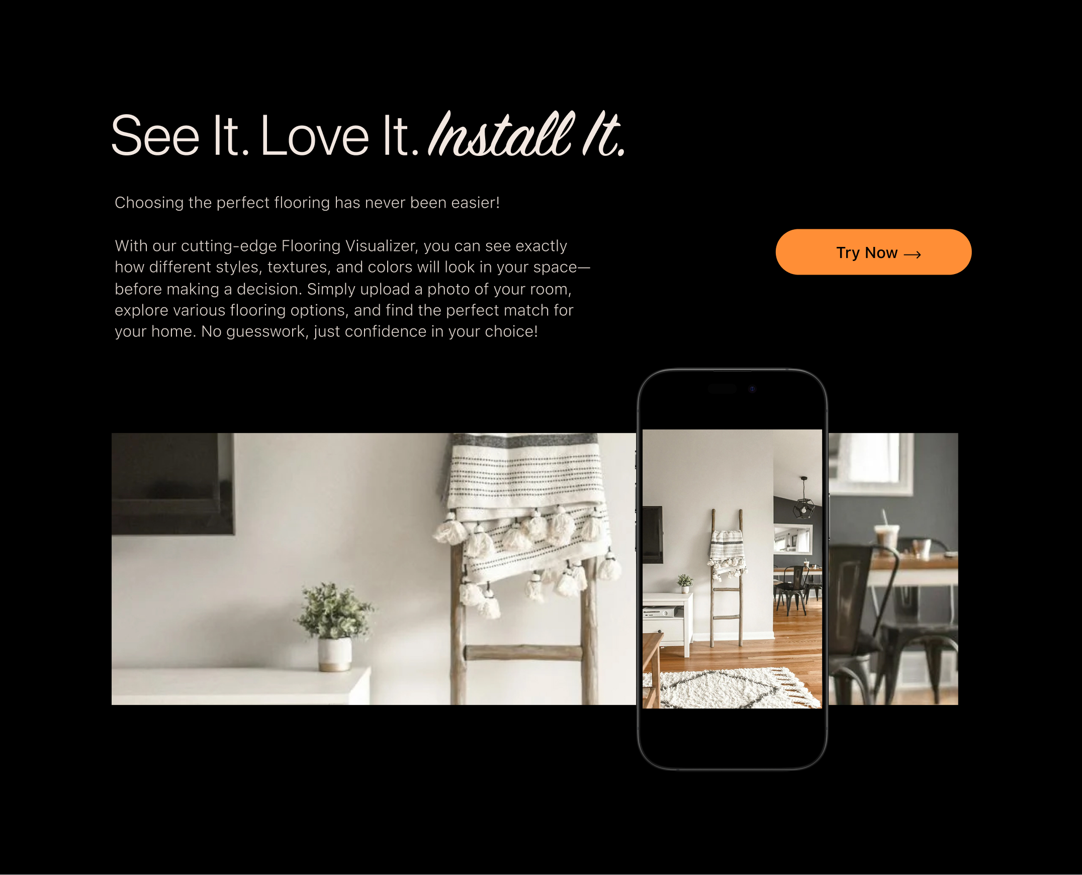
Our Visualizer
Moving
Moving the phone changes the screen view, showing different angles of the room. (Next Step)