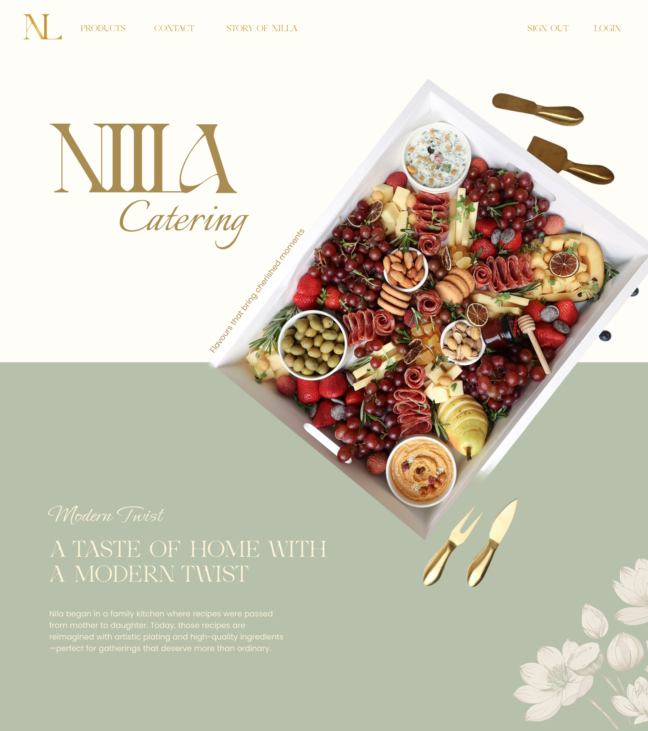
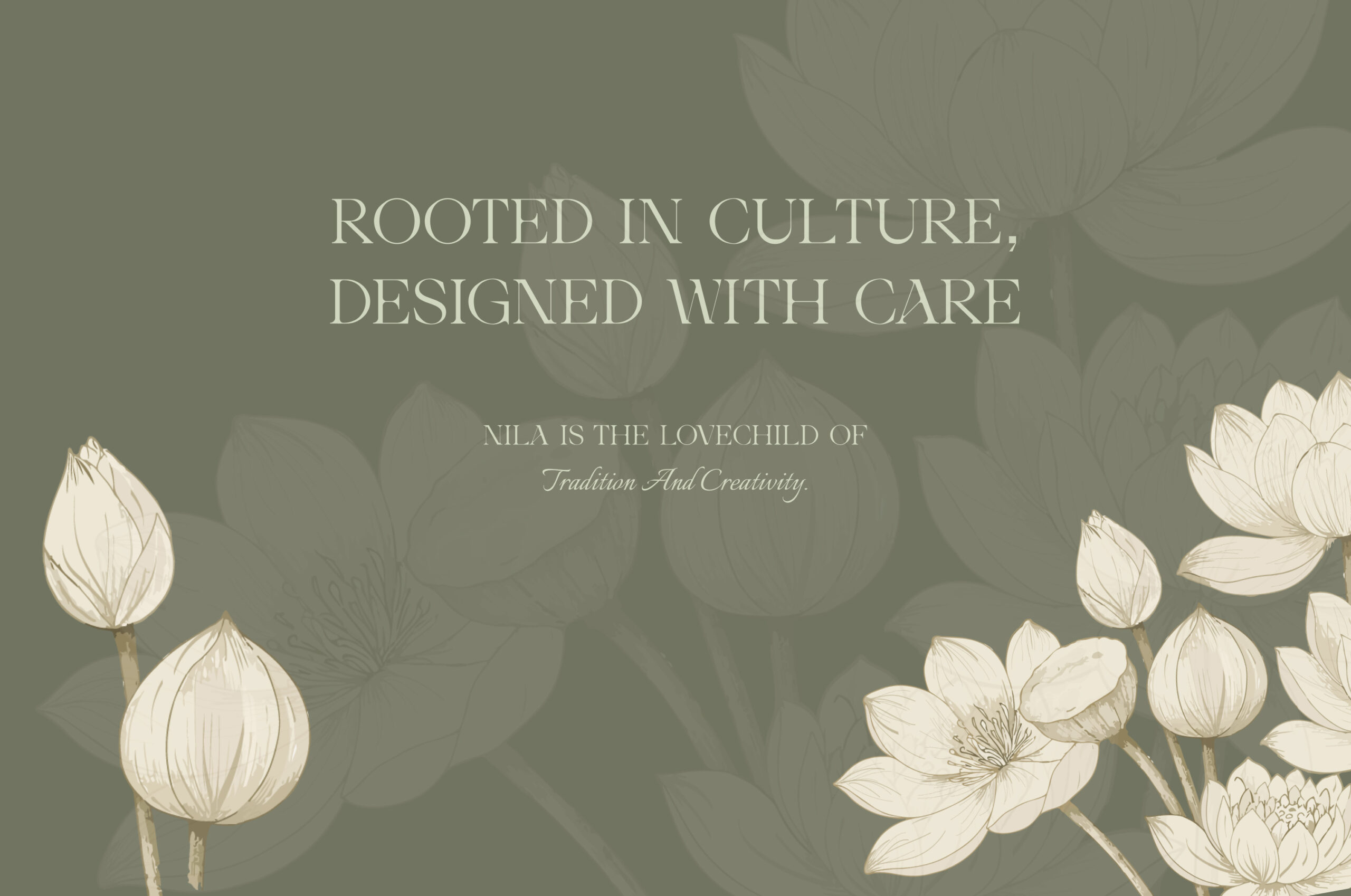
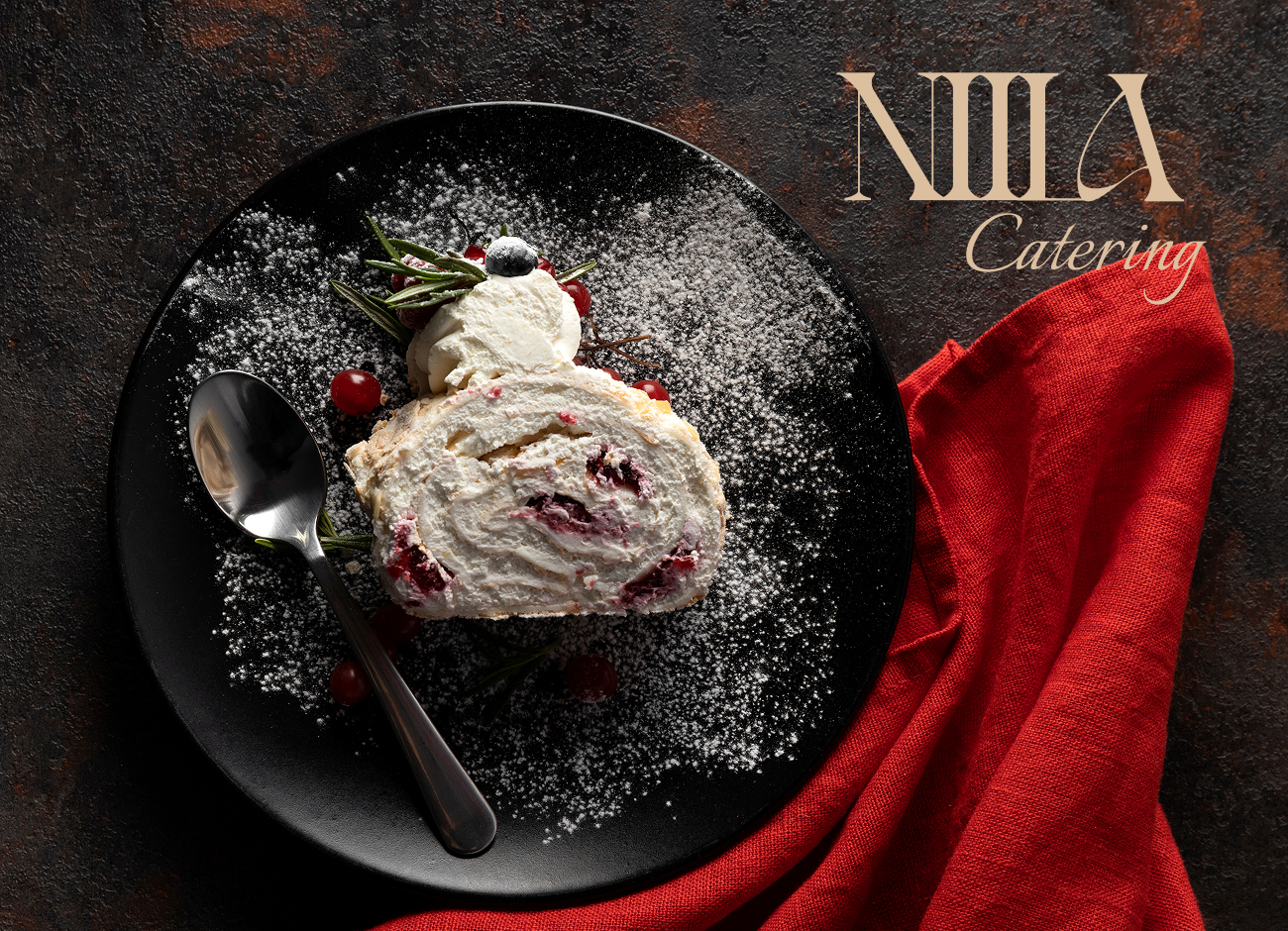
Nila is a Persian catering brand that brings taste, art, and care together. It’s a blend of tradition and creativity. As they describe on their website, every dish is made with heart and imagination, and their long-term goal is to grow the business into a family venture built on shared passion and values.
About the Project
The Art Direction of the NILA
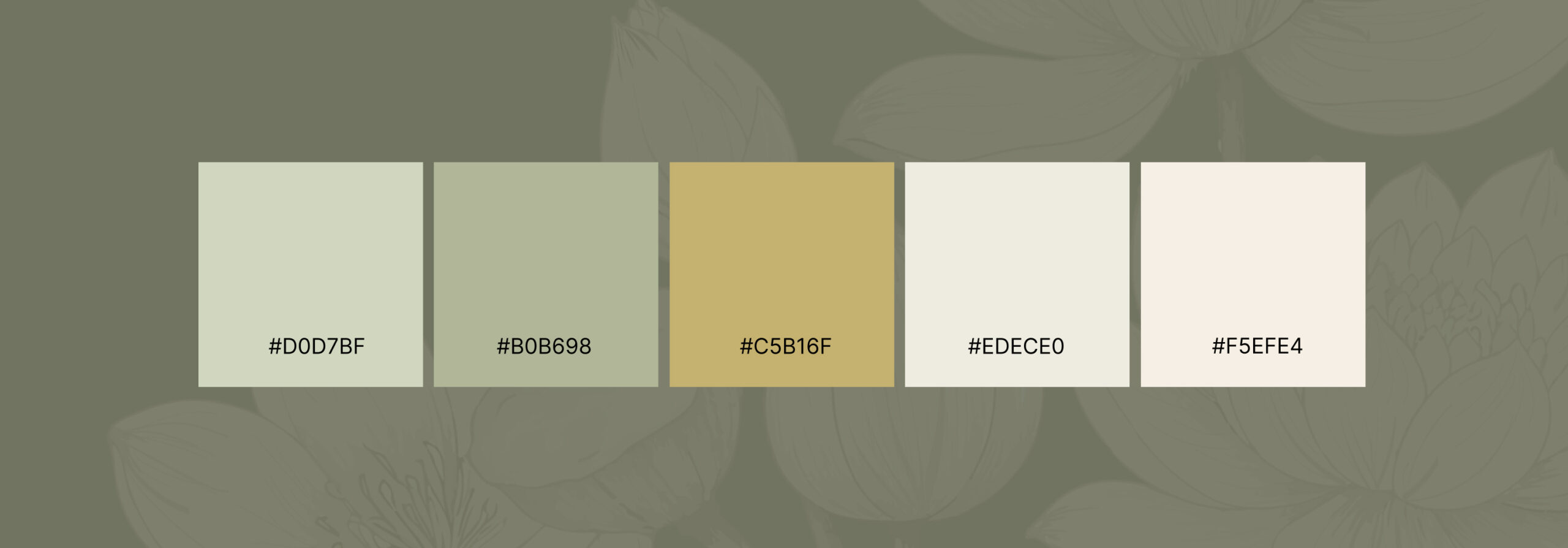
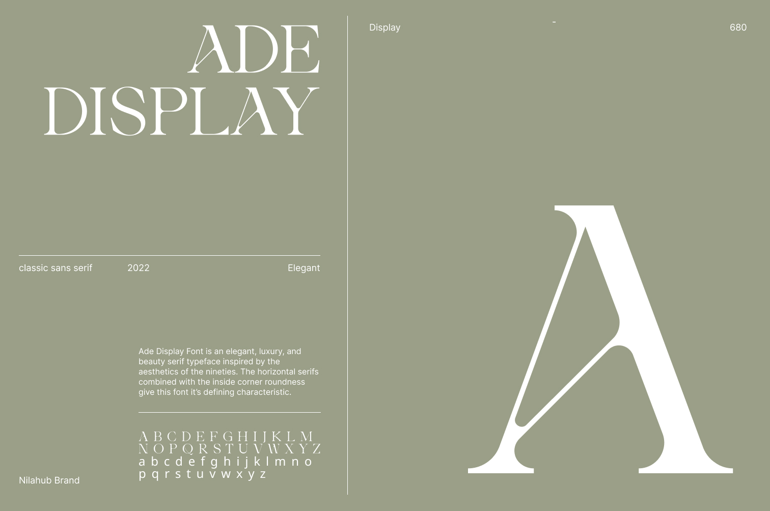
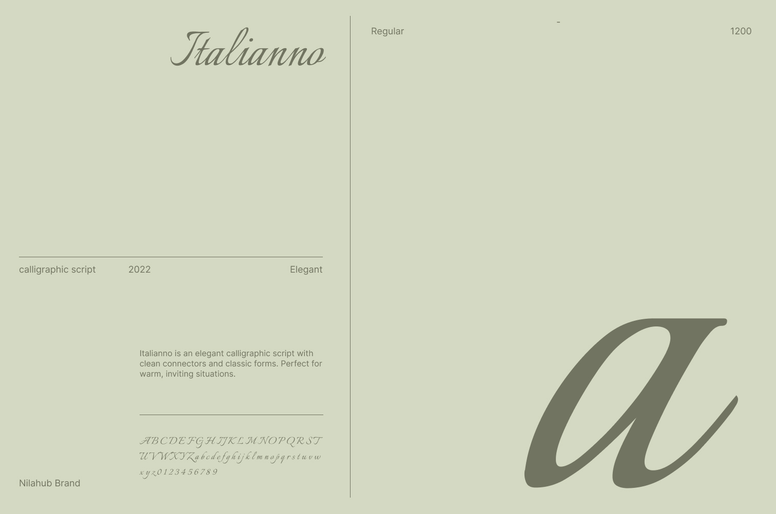
In this project, I worked as the creative director. I shaped the visual direction of the brand, including the logo, typography, color palette, photoshoot style, and the pattern design used on packaging such as boxes and belly bands.
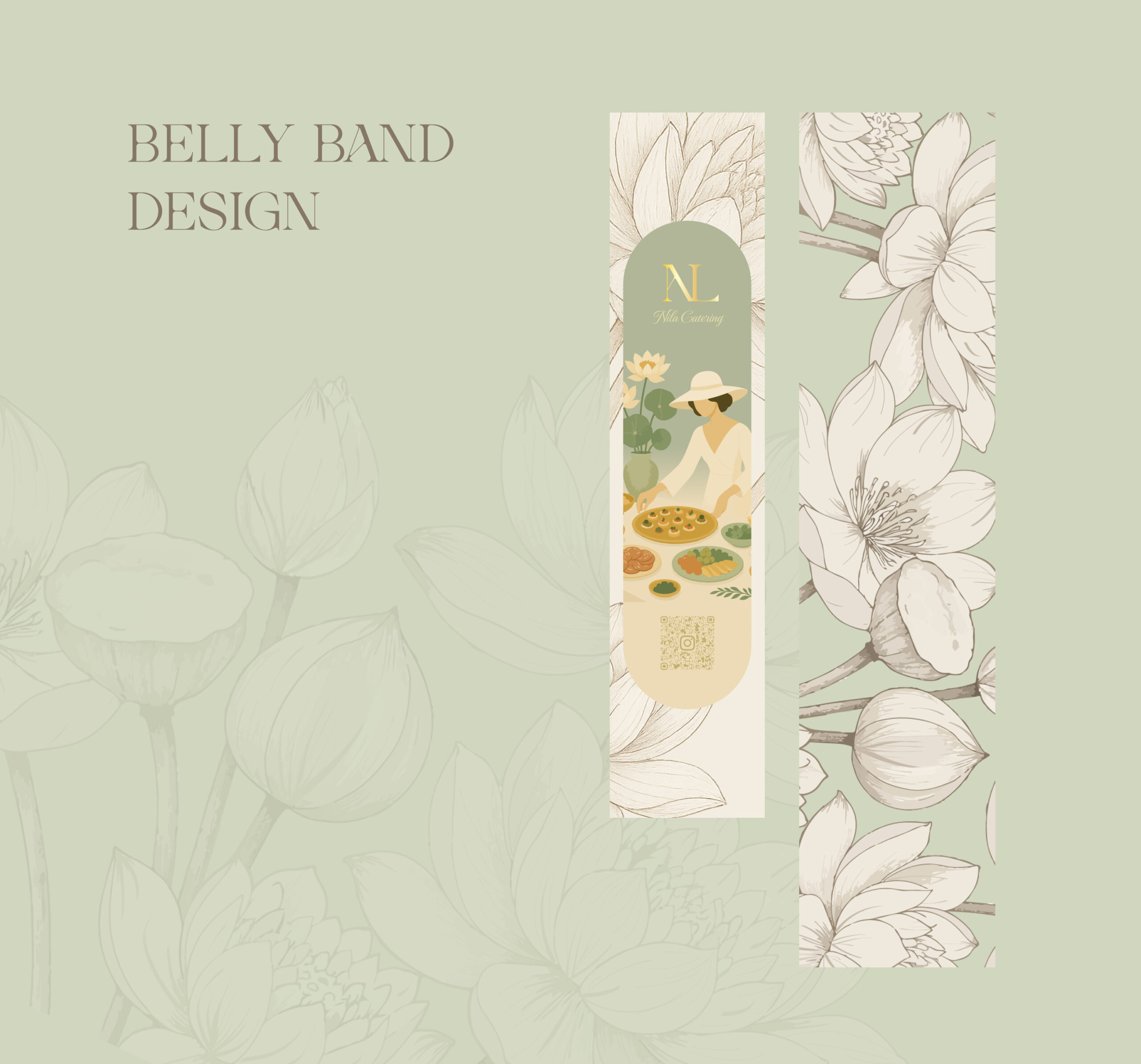
Since Nila delivers finger-food packages, we needed functional and beautiful packaging. I designed the belly bands for the boxes to highlight the handmade and natural feel of the brand. The lotus symbol appears here as well to keep the identity cohesive.
Brand Direction
From Structure to Flow
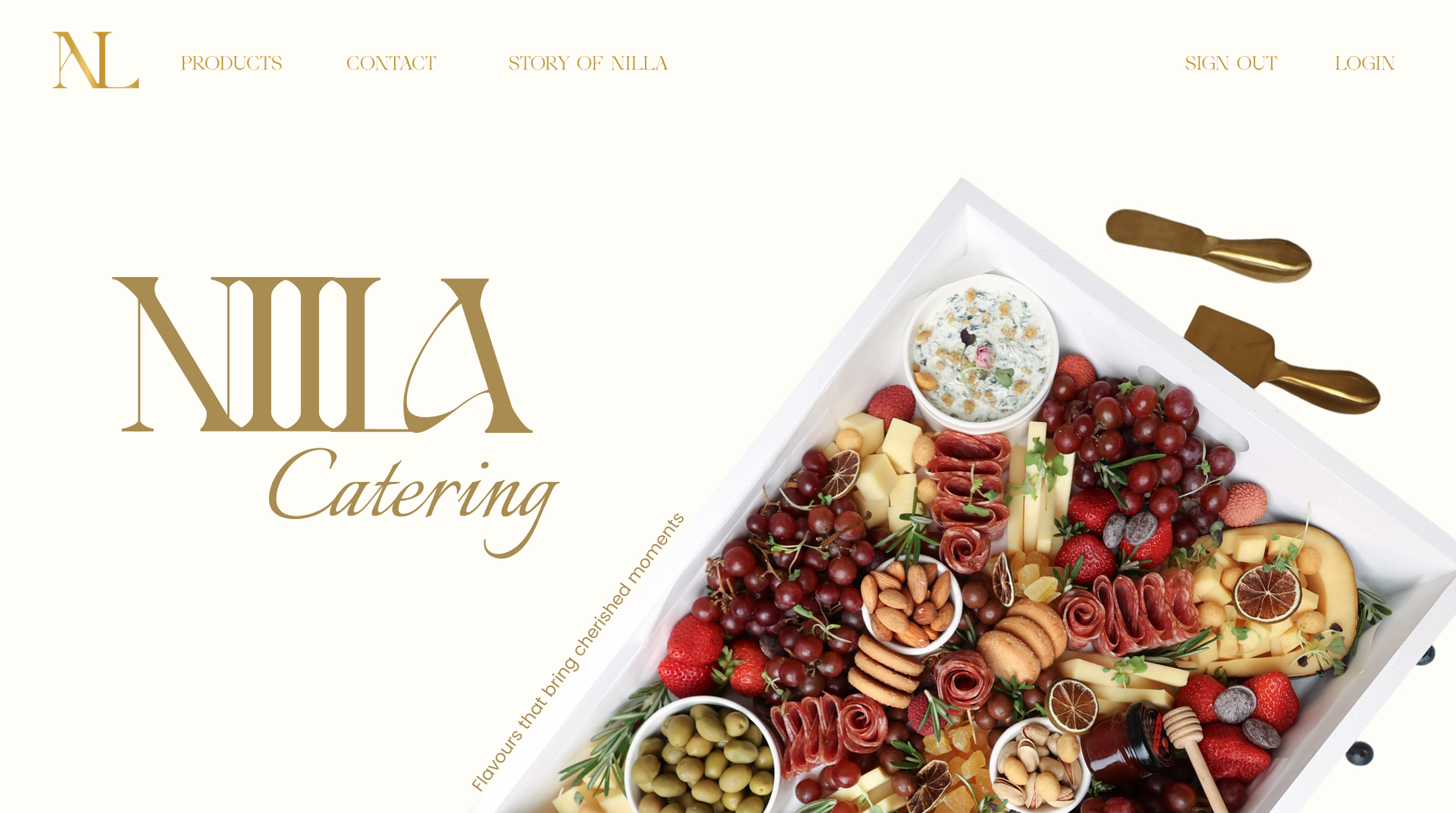
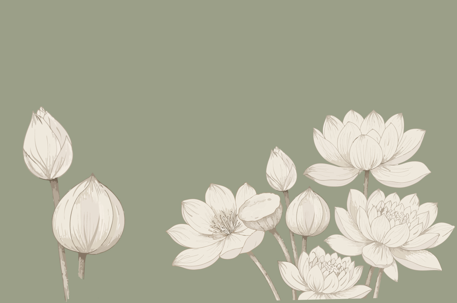
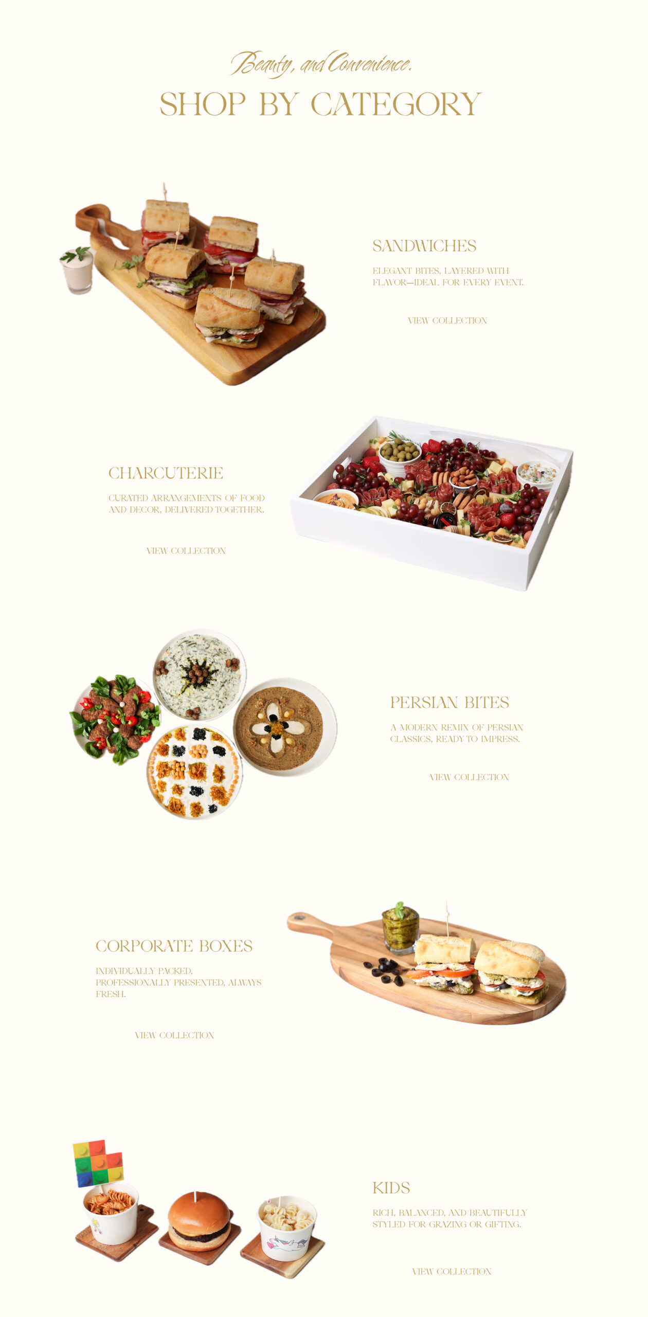
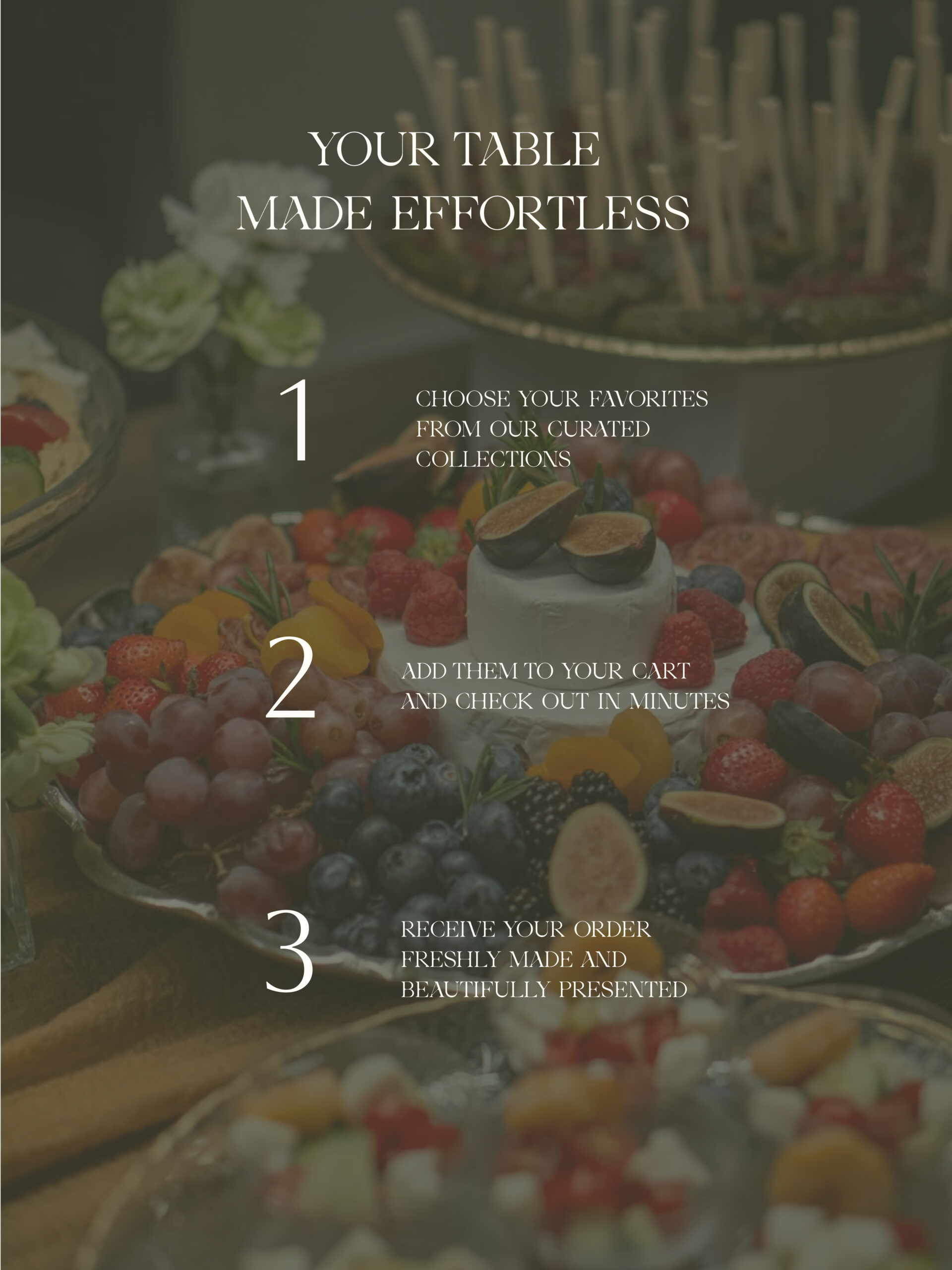
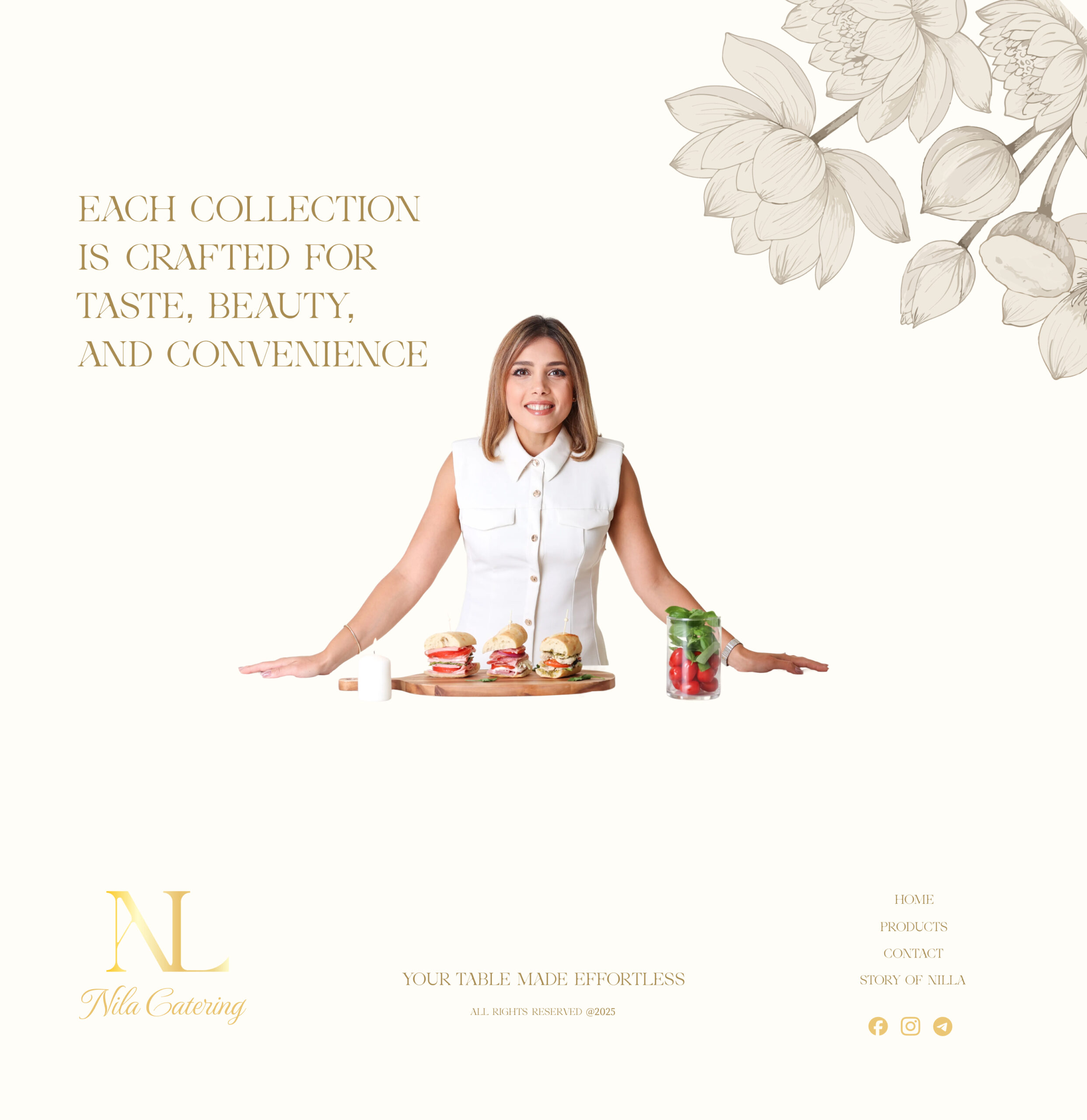
The name Nila comes from the Persian word for the lotus flower. I used the lotus shape and pattern throughout the branding to connect the brand to its cultural roots. The art direction is clean, modern, and soft—reflecting the feeling of the Nila experience.
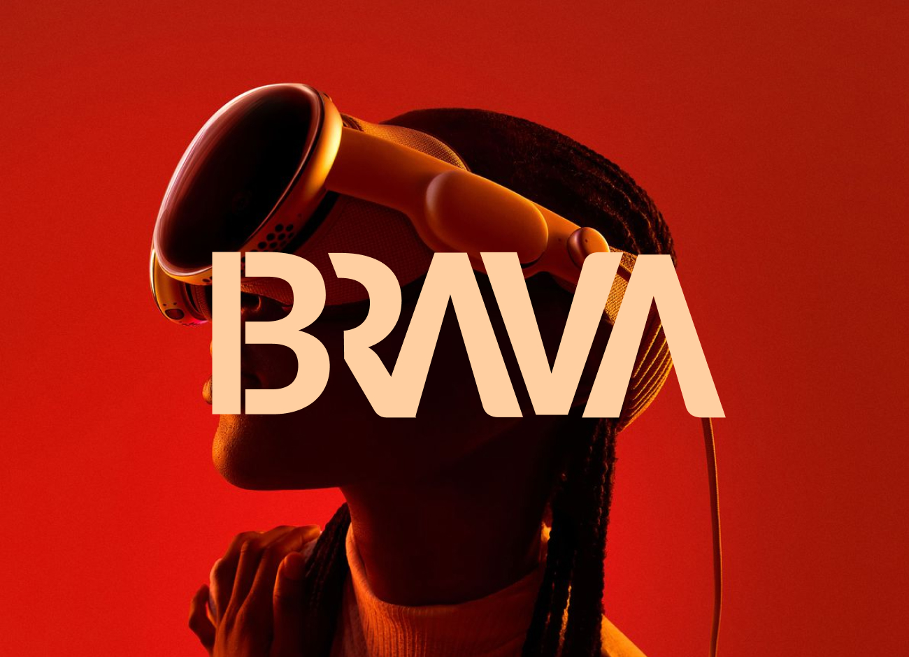
Logo Redesign
The Shape of Strategy
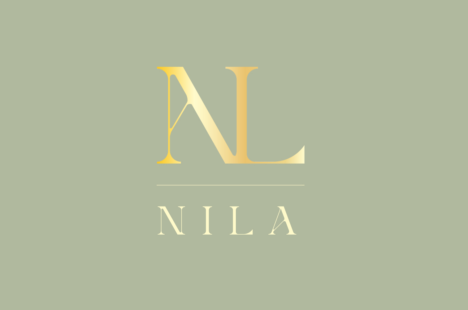
Nila’s logo is minimal and built by playing with the letters N, I, L, A. I combined the characters to create a simple and memorable form that matches the brand’s tone.
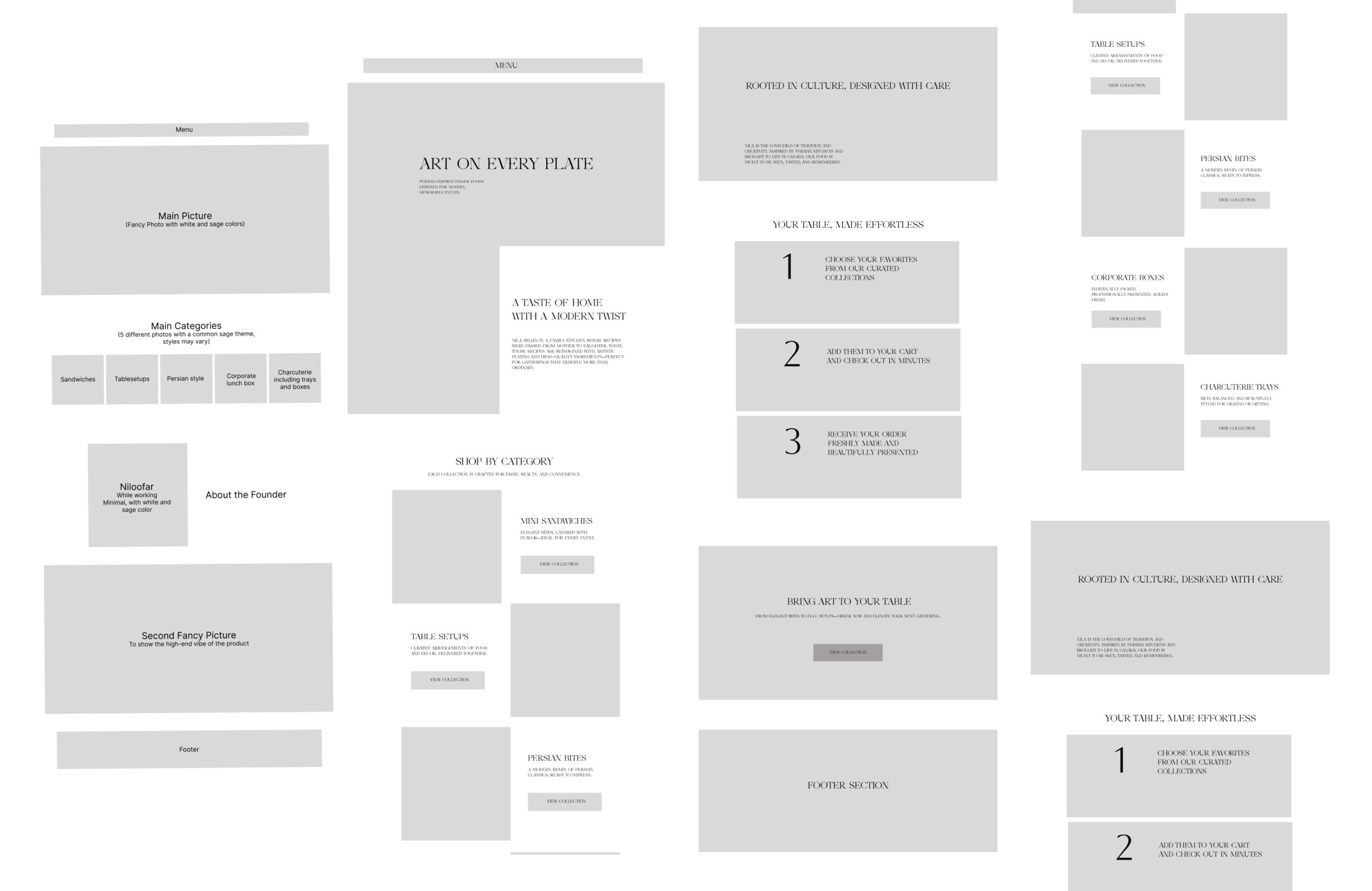
Wireframing
From Structure to Flow
The wireframes focused on hierarchy and storytelling. Each page begins with clarity — what Brava does — then builds toward trust — why they’re different. By defining clear sections and CTAs, I turned a complex service offering into a structured, digestible experience.